The Cart Component in ClickFunnels is a built-in feature that displays the shopping cart when customers click the Cart Icon on any Store page. It works like a popup, sliding in from the right side to show cart contents, allow quantity adjustments, and provide a direct path to checkout. In this article, you will learn how the Cart Component functions and interacts with the Cart Icon element.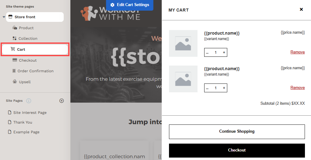
Requirements
An active ClickFunnels account
How the Cart Component Works
The Cart component is an integrated feature of the ClickFunnels Store, not a standalone page. It behaves like a popup that slides in from the right side and appears only when triggered by the Cart Icon. You can also view and customize the Cart modal, including colors, fonts, and certain styling options. The Cart component and Cart Icon element work together to provide a seamless shopping experience:
Adding Items to the Cart
Customers add products to their cart using the Add To Cart button.
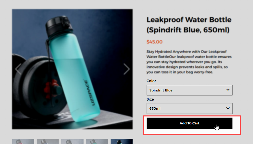
The Cart Icon updates dynamically to reflect the number of items in the cart.
Opening the Cart
Clicking the Cart Icon triggers the Cart Component, which slides in from the right.
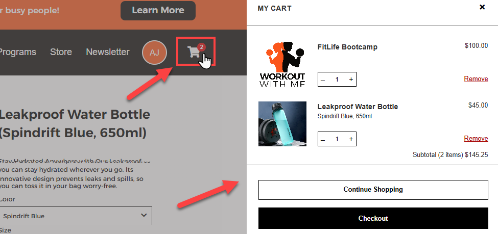
The cart displays product details, prices, quantity controls, and a checkout option.
Managing Cart Contents
Customers can increase or decrease quantities or remove items directly from the cart.
A “Continue Shopping” button allows customers to return to browsing.
Proceeding to Checkout
Clicking “Checkout” takes customers to the Store Checkout Page to complete their purchase.
After completing an order, the cart resets to an empty state.
Accessing the Cart Component
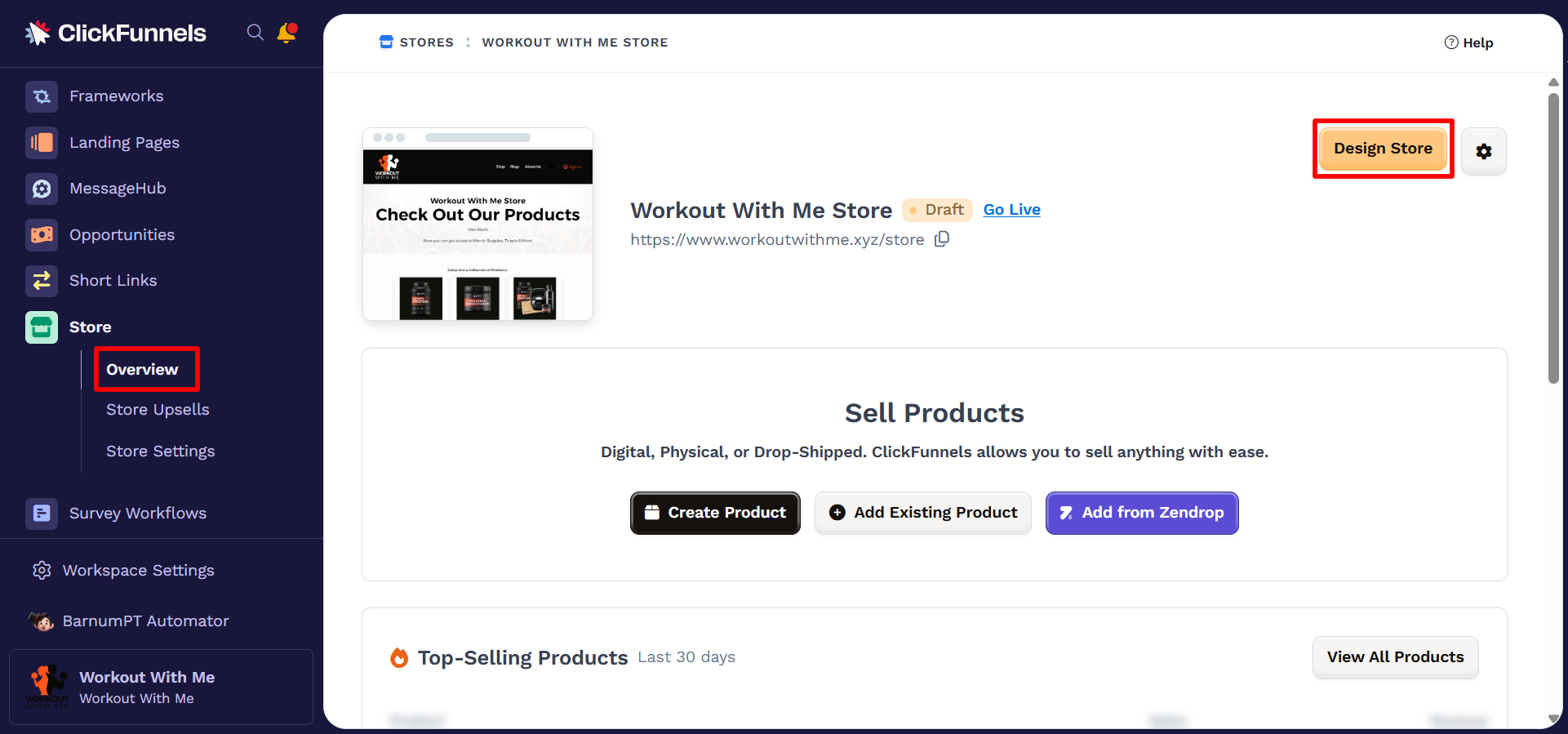
From your workspace, navigate to the Store app in the left-hand menu.
Select Overview.
Click Design Store in the top-right corner.
Under the Site Theme Pages, Expand Store Front.
Select the Cart menu to preview the Cart modal.
Click the
⚙️ Edit Cart Settings option or anywhere in the cart modal to access the modal settings.
Adjust the settings and customize the design of the Cart modal.
Customizing the Cart Component
When you click the Cart component in the Theme, the Cart Modal will be displayed. Click the ⚙️ Edit Cart Settings option or tap anywhere within the modal preview to open its settings panel.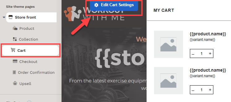
Cart Preview
The Preview setting allows you to toggle between two cart states: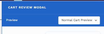
Normal Cart Preview: Displays how the cart looks when items are added.
Empty Cart Preview: Displays how the cart appears when no products have been added.
Paint
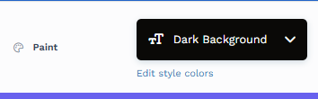
Paint colors are predefined color sets applied to the Cart container. These color sets define the styling for various elements within the container, including text, buttons, icons, etc.
By selecting a paint color in the container settings, all nested elements within the container will automatically inherit the corresponding colors from the style guide. This functionality ensures a consistent design across the container.
Edit Style Colors: Click "Edit Style Colors" to access the style guide and customize the paint's color palette. Learn more about customizing Paint colors in the article How to Customize Style Colors.
Background and Typography
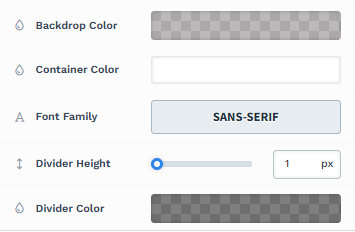
Backdrop Color: Adjust the background color that appears behind the cart.
Container Color: Change the background color of the cart’s container.
Font Family: Choose a font style for the text inside the cart.
Divider Height & Color: Modify the thickness and color of dividers between cart sections.
Header
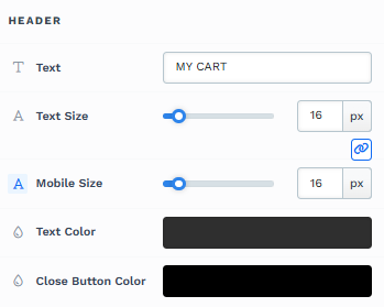
Text: Customize the heading of the cart (default is "MY CART").
Text Size & Mobile Size: Adjust font size for desktop and mobile views.
Text Color: Change the color of the cart title.
Close Button Color: Customize the color of the close button (X icon).
Text
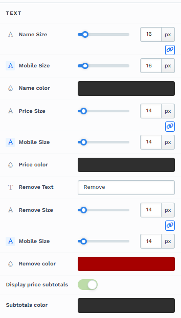
Name Size & Color: Modify product name font size and color.
Price Size & Color: Adjust price font size and color.
Remove Text & Color: Customize the appearance of the "Remove" button.
Display Price Subtotals: Toggle whether to show item subtotals.
Subtotal Color: Change the color of the subtotal text.
Button
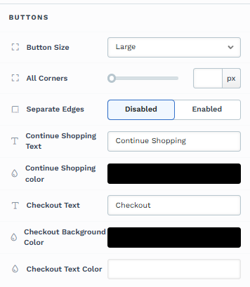
Button Size: Select a size for the cart buttons.
All Corners & Separate Edges: Adjust the button’s corner styling.
Continue Shopping Text & Color: Customize the label and color of the "Continue Shopping" button.
Checkout Button Text, Background Color, and Text Color: Modify the appearance of the checkout button.
Quantity
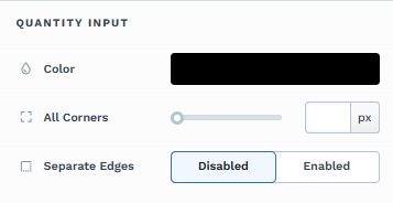
Color: Change the color of the quantity input box.
All Corners & Separate Edges: Adjust the rounding and border styles of the quantity selector.