The Cart Icon element in ClickFunnels is a standalone feature that allows customers to track and access their shopping cart on any Store, Site, or Landing page. It displays the current cart state and allows customers to open and view their shopping cart by clicking the icon. In this article, you will learn how the Cart Icon works, its functionality, and how to set it up..png "image(494).png")
Requirements
An active ClickFunnels account
Any store, site, or landing page
Where to Use the Cart Icon
The Cart Icon element can be used on Store pages (e.g., Product, Storefront, Collection, and Checkout pages). In addition, it also works on Site pages and Landing pages when the Add to Cart element is added within the Products Collection element.
It provides a consistent and user-friendly way for customers to view their cart status and access their shopping cart as they shop. Whether they add items to the cart, return to browse more products, or complete their order, the Cart Icon dynamically updates to reflect the current cart state and allows customers to open the cart for further action.
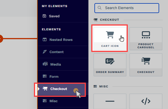
Adding a Cart Icon Element in the Page Editor
Inside the page editor, add a Section where you want to place the element.
Add a Row within that section.
Click the orange + Plus or Add New Element button inside the row to insert a new element.
From the Checkout category, select the Cart Icon element.
Note:
In the Storefront and Product page, the Cart Icon element needs to be added from the Commonly Used category.
Once the Cart Icon element is added, you can customize its appearance to fit your page design.
How the Cart Icon Works
The Cart Icon ensures a smooth and intuitive shopping experience for your customers by keeping track of their cart status in real time and allowing easy access to the cart..png "image(495).png")
Cart Updates Across Store Pages:
When a customer adds a product to the cart using the Add To Cart button, the Cart Icon immediately updates to display the total number of items in the cart.
This update is persistent across all Store pages. For example, if a customer adds an item to the cart on a Product page and then returns to the Store Front, the Cart Icon will display the updated item count.
Access the Shopping Cart:
By clicking the Cart Icon, customers can open the shopping cart panel from the right side of the page. This panel shows all items added to the cart, their quantities, and the total cost.
Shopping Continuity:
Customers can add products to their cart and continue browsing without losing their cart state. The Cart Icon remains visible and accessible across all Store pages, showing the number of items in the cart and providing access to the cart.
Empty Cart State:
When the cart is empty (e.g., after completing an order or removing all items), the Cart Icon updates to reflect this state. For instance, if a customer lands on the Order Confirmation page after completing a purchase, the Cart Icon will display an empty cart.
Helpful Resources:
Customizing the Cart Icon Element
When you hover over an element, its border will be highlighted in orange. To access an element's settings, click on the gear ⚙️ icon or click directly on the element.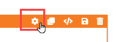
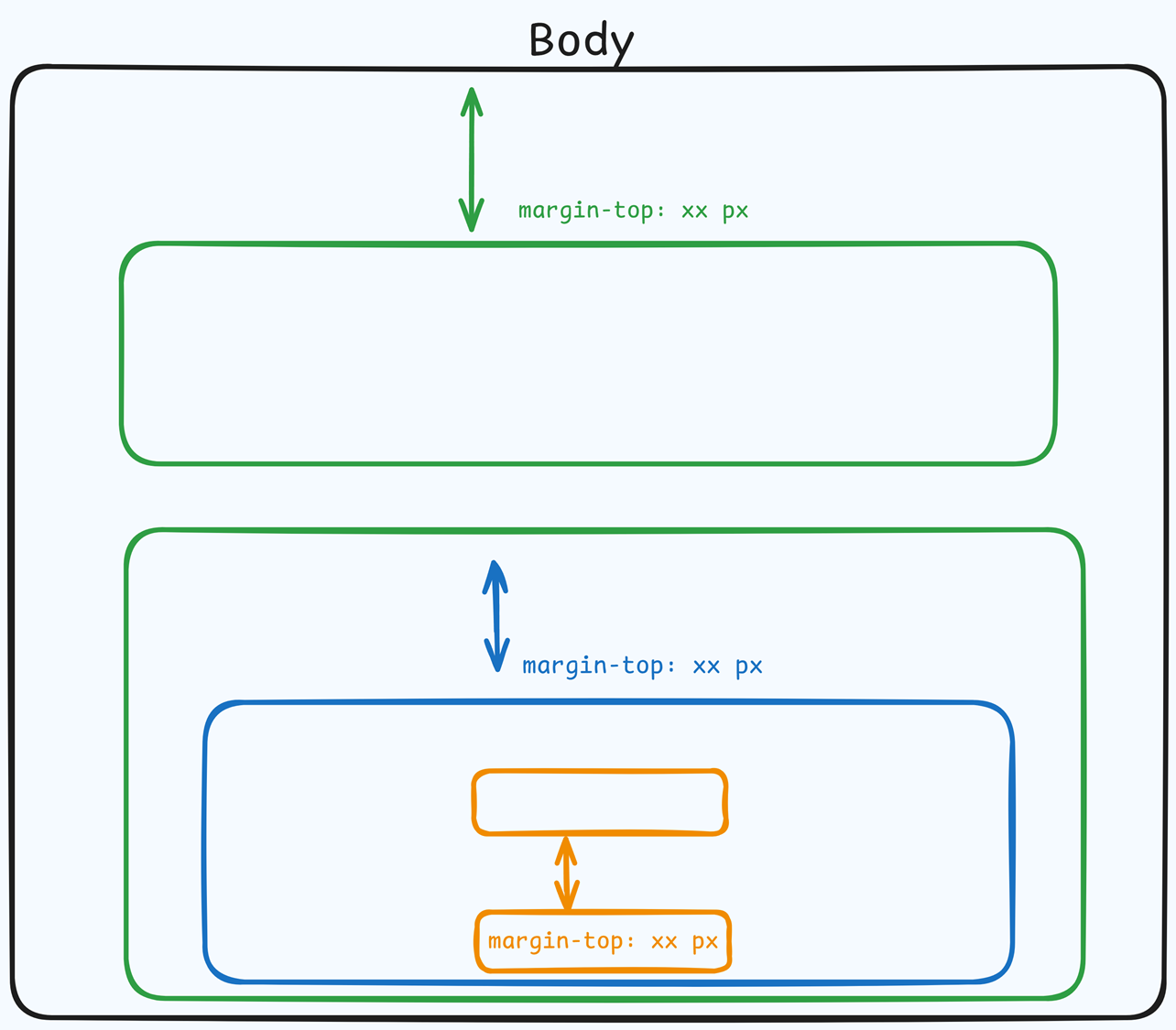
Top Margin
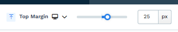 The Top Margin setting lets you control the space between the current container (section, row, flex, and element) and the container directly above it. If no previous container exists, the margin will be applied relative to the parent container. If no preceding container is added, the Body will be the parent.
You can set top margin values independently for desktop and mobile by using the device icons (px) or percentage (%) to create consistent spacing across screen sizes.
Icon Settings
Icon Size: Choose Small, Medium, or Large to fit the page design.
Icon Style: Select the visual representation of the Cart Icon, such as a shopping cart or bag.
Icon Color: Customize the color of the Cart Icon to align with your brand.
Align: Position the Cart Icon within its container to the left, center, or right.
Count Settings
Count Color: Change the color of the number displayed on the Cart Icon, which indicates the number of items in the cart.
Count Background Color: Set a background color for the count number to make it stand out.
Link Behavior on Checkout Page
The Link Behavior on Checkout Page option determines how the Cart Icon behaves once customers have added products to their cart and proceed to the Checkout page. This ensures a streamlined experience during the checkout process by controlling the visibility and functionality of the Cart Icon. Here’s how each option works:
Redirect to Store: Clicking the Cart Icon redirects customers back to the Store Front, allowing them to continue shopping.
Hide Cart Icon: The Cart Icon will not be displayed on the Checkout page. This helps avoid distractions and keeps customers focused on completing their purchases.
Disable Cart Icon: The Cart Icon remains visible on the Checkout page but is inactive and not clickable, ensuring a consistent design while preventing cart access.
Control Panel
The Control Panel appears at the bottom of every container(Section, Row, Flex, and Element) in the page editor, offering quick access to essential settings and actions for that container. Here’s what each icon represents:.png "image(47).png")
ALL: The container will be visible on all devices (desktop, tablet, and mobile).
Desktop (
🖥️ ) Icon: The container will only be visible in desktop view.Mobile (
📱 ) Icon: The container will only be visible in mobile view.Eye (
👁️ ) Icon: Use this to hide the container from the page. Once clicked, the container will be hidden in the editor but not deleted. You can click the Layout menu in the top navigation bar to find the hidden containers. Select All, Desktop, or Mobile icon to unhide in the editor.Code (</>) Icon: This icon opens the code editor, where you can insert custom CSS or JavaScript code to modify the container's behavior or styling.
Trash (
🗑️ ) Icon: Removes the container from the page editor entirely.
Advanced Settings
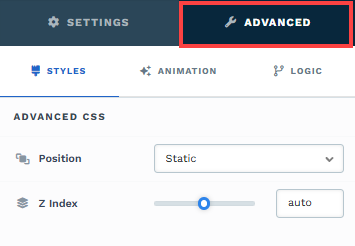
To further customize your container (section, row, column, and element), ClickFunnels provides Advanced settings that allow you to control style, advanced CSS, animation, and rendering logic. We’ve separated these advanced features into dedicated articles to avoid overwhelming you with too much content in one place and to keep our documentation concise. Explore the following resources for more details:
Advanced Settings - Customize Styles: Learn how to populate contents dynamically, position containers, and apply z-index.
Advanced Settings - Customize Animation: Learn how to add animations, control entry and exit effects, and adjust animation delay.
Advanced Settings - Customize Logic: Learn how to apply conditional logic to elements and add custom attributes.