The Add To Cart element is an essential feature in ClickFunnels. Customers can directly select and add products to their shopping carts from the sales page. This element offers extensive customization options to match your brand and optimize user interactions. In this article, you will learn how to use the Add To Cart element, configure its settings..png)
Requirements
An active ClickFunnels account
The Store Product page or
Site pages and Landing pages (within Products Collection element)
The Cart Icon element added to the page (for dynamic cart updates)
Where to Use the Add To Cart Element
The Add To Cart element works in the following contexts:
Store Product page
Store pages: Store Front, Collection, and Checkout
Site pages and Landing pages: when used within the Products Collection element
Open a supported page in the editor.
On Site and Landing pages, ensure the page includes a Products Collection element
Add the Add To Cart element in the editor.
Important:
The Cart Icon element is required for the Add To Cart element to display dynamic cart updates on the supported pages. Without it, the editor will display a warning to insert the Cart Icon element.
Adding an Add To Cart Element in the Page Editor
Inside the page editor, add a Section where you want to place the element.
Add a Row within that section.
Click the orange + Plus or Add New Element button inside the row to insert a new element.
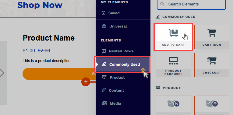
From the Commonly Used category, select the Add To Cart element.

Once the Add To Cart element is added, you can customize its appearance to fit your page design.
How the Add To Cart Element Works
The Add To Cart element is designed to work exclusively within the Store Product page. The Cart Icon element must also be on the same page to function properly. This integration ensures that the customers can easily manage their cart while browsing and selecting products..png)
Here’s how it works:
The Add To Cart element reads the product context from the page where it’s placed and adds that product to the shopper’s cart. The Cart Icon element should be present on the same page to ensure the cart panel is visible and updates in real time.
Product Context and Selection:
On a Store Product page, the element references the product currently being viewed.
On Storefront or Collection pages and on Site or Landing pages with a Products Collection element, the element references the product shown in the associated product card.
Adding to Cart: On the Product page, customers can choose their desired options (if applicable) and click the Add To Cart button, which triggers the cart functionality.
Cart Display: When a customer adds a product to the cart, the Cart Icon element ensures that the shopping cart becomes visible from the right-hand panel of the page. This panel allows users to view the items they’ve added, modify quantities, or proceed to checkout.
Combining the Add To Cart and Cart Icon elements creates a streamlined and intuitive process for customers to select and purchase products from your store. This setup enhances user experience and drives conversions, making the shopping journey effortless.
Helpful Resources:
Customizing the Add To Cart Element
When you hover over an element, its border will be highlighted in orange. To access an element's settings, click on the gear ⚙️ icon or click directly on the element.
Top Margin
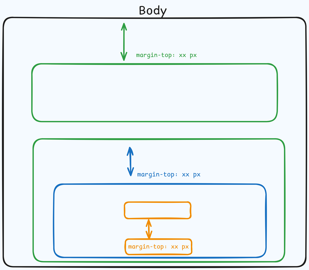
 The Top Margin setting lets you control the space between the current container (section, row, flex, and element) and the container directly above it. If no previous container exists, the margin will be applied relative to the parent container. If no preceding container is added, the Body will be the parent.
You can set top margin values independently for desktop and mobile by using the device icons (px) or percentage (%) to create consistent spacing across screen sizes.

Name, Description, and Compare At

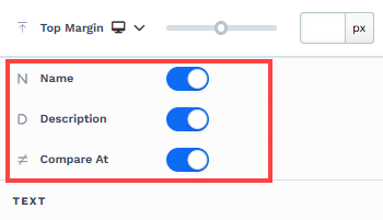
These switches control whether the Add To Cart element displays the product title, description, and the "compare at" price in the UI. Use them to keep the element concise or expose more context to shoppers.
Name: Show or hide the product title within the element.
Description: Show or hide the product description text.
Compare At: Show or hide the strikethrough "compare at" price when an original/reference price exists.
Text Settings
The Text Settings allow you to customize the textual elements within the Add To Cart container, such as the product headline, description, price, and any additional text associated with the element. By modifying these settings, you can ensure the text aligns with your branding, is visually appealing, and remains easy to read on both desktop and mobile devices. These settings give you full control over the appearance of textual information displayed in the Add To Cart element.
Font Family: Choose the font style for the text displayed within the Add To Cart element.
Headline Size and Color: Modify the size and color of the product title text.
Description Size and Color: Customize the size and color of the product description text.
Price Size and Color: Set the size and color of the product price display.
Compare At Color: Change the color of the "compare at" price if your product is on sale.
Input Text Color: Adjust the text color inside input fields (e.g., for quantity selection).
Buttons
The Button Settings allow you to customize the appearance and behavior of the "Add To Cart" button within the Add To Cart element. These settings ensure that the button aligns with your brand style, is visually appealing, and encourages customers to complete their purchase. You can adjust various aspects, including size, shape, text, and colors, to create a button that fits seamlessly into your product page design.
Button Size: Select from preset sizes (Small, Medium, Large) to determine the overall dimensions of the button.
All Corners: Adjust the border radius of the button to make it square, rounded, or anywhere in between.
Separate Edges: Enable this option to customize each corner of the button independently for a unique shape.
Add To Cart Text: Modify the text displayed on the button (e.g., "Buy Now" or "Add to Bag").
Add To Cart BG (Background) Color: Change the button’s background color to make it stand out or match your page design.
Add To Cart Text Color: Adjust the text color on the button for better visibility and contrast.
Inputs
The Input Settings allow you to configure the appearance of input fields within the Add To Cart element. These input fields become visible only if the product has variations (e.g., size, color, or subscription options) enabled in the product settings. This section helps you maintain a professional and cohesive look for any product variation options displayed to customers.
Input Size: Adjust the size of the input fields (Small, Medium, or Large) to ensure they fit seamlessly into your design.
Input BG (Background) Color: Customize the background color of the input fields to make them stand out or blend with the page.
Input Text Color: Modify the color of the text inside the input fields for better readability.
Input Border Color: Set the border color of the input fields to match or complement your page design.
All Corners: Adjust the border radius of the input fields to make them square, rounded, or customized.
Separate Edges: Enable this option to style each corner of the input fields independently for a more unique design.
Size
Padding (Top, Bottom, Sides): Control the internal spacing within the Add To Cart element to ensure it fits perfectly with the rest of your page.
Background
Color: Add a background color for the Add To Cart element to make it stand out on the page.
Borders
The Borders settings allow you to customize the appearance of the borders around the Add To Cart element. These settings can help define the element’s structure and ensure it blends seamlessly with your page design. When you select a Border Style (e.g., Solid, Dashed, or Dotted), additional customization options become available. Below is a breakdown of the settings:
Border Style: Choose the type of border you want for the element, such as Solid, Dashed, or Dotted. Selecting a style reveals additional customization options.
Borders: Use the directional control to apply borders to specific sides of the element (e.g., top, bottom, left, right) or all sides.
Color: Set the color of the border to match your branding or make the element stand out.
Stroke Size: Adjust the thickness of the border using the slider or by entering a pixel value for precise control.
All Corners: Modify the roundness of the borders, from sharp corners to fully rounded edges.
Separate Edges: Enable this option to independently style each corner of the border, allowing for a unique and customized design.
Control Panel
The Control Panel appears at the bottom of every container(Section, Row, Flex, and Element) in the page editor, offering quick access to essential settings and actions for that container. Here’s what each icon represents:.png)
ALL: The container will be visible on all devices (desktop, tablet, and mobile).
Desktop (
🖥️ ) Icon: The container will only be visible in desktop view.Mobile (
📱 ) Icon: The container will only be visible in mobile view.Eye (
👁️ ) Icon: Use this to hide the container from the page. Once clicked, the container will be hidden in the editor but not deleted. You can click the Layout menu in the top navigation bar to find the hidden containers. Select All, Desktop, or Mobile icon to unhide in the editor.Code (</>) Icon: This icon opens the code editor, where you can insert custom CSS or JavaScript code to modify the container's behavior or styling.
Trash (
🗑️ ) Icon: Removes the container from the page editor entirely.
Advanced Settings

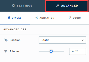
To further customize your container (section, row, column, and element), ClickFunnels provides Advanced settings that allow you to control style, advanced CSS, animation, and rendering logic. We’ve separated these advanced features into dedicated articles to avoid overwhelming you with too much content in one place and to keep our documentation concise. Explore the following resources for more details:
Advanced Settings - Customize Styles: Learn how to populate contents dynamically, position containers, and apply z-index.
Advanced Settings - Customize Animation: Learn how to add animations, control entry and exit effects, and adjust animation delay.
Advanced Settings - Customize Logic: Learn how to apply conditional logic to elements and add custom attributes.