The challenge of showcasing multiple products neatly on a page can quickly become complex, especially when managing a growing inventory. ClickFunnels simplifies this with the Products collection element, a dynamic grid container designed to display all your available products in one place. In this article, you will learn how the Products collection element dynamically displays the products from your workspace.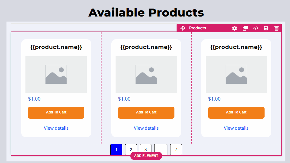
Requirements
An active ClickFunnels account
At least one product created in your workspace
The “online store” option enabled in the product settings
Products added to the funnel page (when used in a funnel page)
Understanding the Collections Elements
Imagine you’re organizing a photo album. The album is the Collection Element, which is a container that holds and displays individual photos. Each photo in the album represents an item in the collection, such as a product, blog post, or lesson.
Now, think about how the album is arranged:
Photos are displayed in rows and columns on each page (just like the grid layout in a Collections element). For example, you might have 3 photos per row and 4 rows on a page.
If the album has more photos than can fit on one page, you add page numbers to flip through the additional pages, similar to how pagination works for larger collections in ClickFunnels.
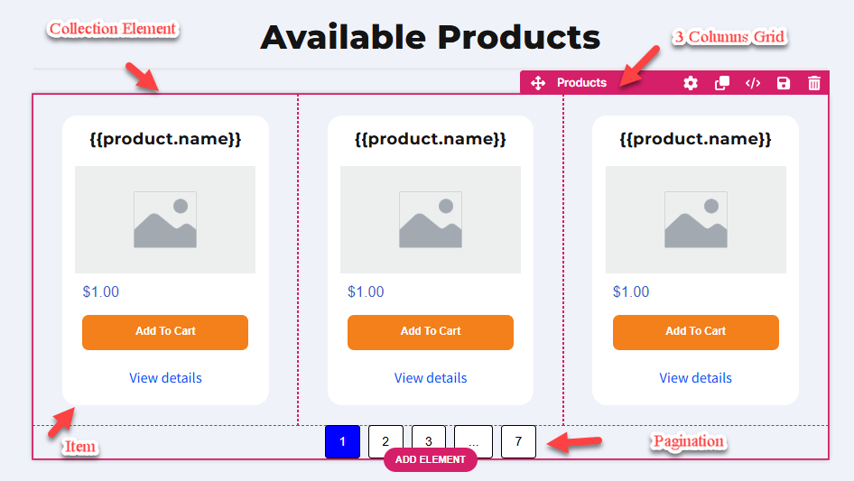
A Collection element in ClickFunnels is a container designed to display collections of content dynamically. A collection consists of grouped items such as products, blog posts, course modules, lessons, and more. Adding a Collection element to your page lets you showcase these items in an organized and visually engaging way. Each container allows you to insert dynamic content elements, such as product names, descriptions, images, prices, or links, to represent the associated data within the collection.
Behind the scenes, a Collection element uses the CSS grid layout (via the display: grid property) to organize its contents. This layout divides the container into rows and columns, ensuring all items are evenly spaced and aligned. The grid layout's structure makes it highly adaptable, automatically adjusting the arrangement of items based on the number of elements, the number of columns specified, and the available screen size.
For example:
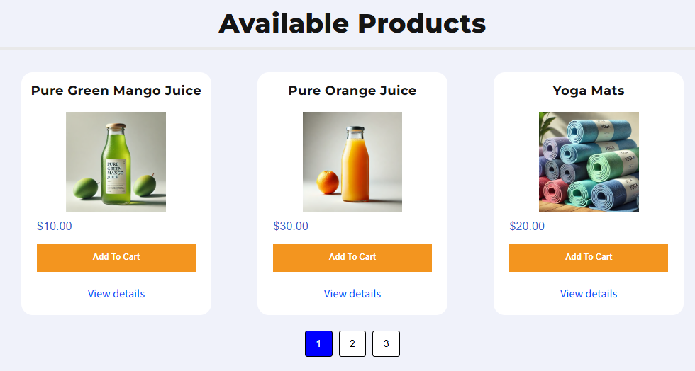
When visitors browse your store, you can use the Products collection element to display all your products with key details like name, price, and description.
The Blog Posts collection element allows you to showcase recent or featured blog posts from your blog.
The Lessons collection element is ideal for displaying all lessons within a module template page, while the Modules collection element can list all course modules on the Course home page.
Adding the Products Collection Element in the Editor
Inside the page editor, add a Section where you want to place the element.
Add a Row within that section.
Alternatively, insert a Flex container instead of a section and row.
Click the orange + Plus or Add New Element button inside the row to insert a new element.
From the Collections category, select the Products element.
Once inserted, configure the number of items displayed per row. By default, the element displays three items per row. You can change this setting to adjust the layout. For example, selecting 4 “Items Per Row” and 8 “Items Per Page” will create a two-column row, each divided into four columns.
.png "image(551).png")
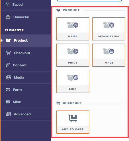
Inside each grid of the Collection element, insert associated content elements. For example, for a “Products” collection element, you can insert Name, Description, Price, Image, Link, and Add to Cart elements specially designed to populate data in the “Products” collection element dynamically.
Note:
When adding a collections element, ClickFunnels highlights eligible elements with a red border, ensuring you add compatible dynamic items.
Once associated elements are added, they will be replicated across all grid columns. The liquid syntax within these elements dynamically pulls data from the products, ensuring each item is unique. The element will display all available products visible for the online store.
Note:
The Products collection element renders on funnel pages. It shows items only when products are added to the page; if no products are added, the grid will be empty and will not render on page load. Filter by Bump works when the element is added on a funnel page and lets you show all products, only bump products, or only non‑bump products.
Adding Dynamic Elements in the Grid
When you add the Products collection element to a page, you’ll fill each grid card with smaller collection-aware elements. When your cursor is inside a grid and you open the elements panel, ClickFunnels highlights the compatible Product elements with a red border to show they’ll work dynamically inside the collection. These elements automatically pull data from the product represented by that grid; no manual data entry is required.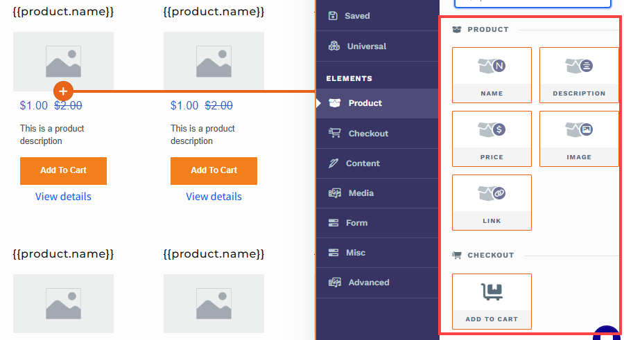
How dynamic content appears
When you drop a Product element into a grid, the editor shows a placeholder such as {{product.name}} or {{product.display_price}}. These are Liquid placeholders. On your live page, ClickFunnels replaces them with the real product data from your workspace.
Note:
Add an element to one grid item and ClickFunnels replicates it across every grid item in the collection. The structure stays consistent, while the content changes per product.
Elements you can add inside each grid item
Name
What it shows: The product’s name from your product settings.
Placeholder:{{product.name}}Description
What it shows: The product description you saved in the product settings.
Placeholder:{{product.description}}Price
What it shows: The product’s price as configured in your store.
Placeholder: Commonly appears as{{product.display_price}}.Image
What it shows: The product image stored in your product settings.
Placeholder: ImageLink
What it does: Adds a dynamic text link that points to the grid item product page.
Placeholder: View DetailsAdd To Cart (Checkout → Add To Cart)
What it does: Adds the specific product in that grid item to the shopper’s cart.
Customizing the Products Collection Element
When you hover over a collection element, its border will be highlighted in magenta. To access its settings, click on the gear ⚙️ icon or click directly on the element.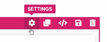
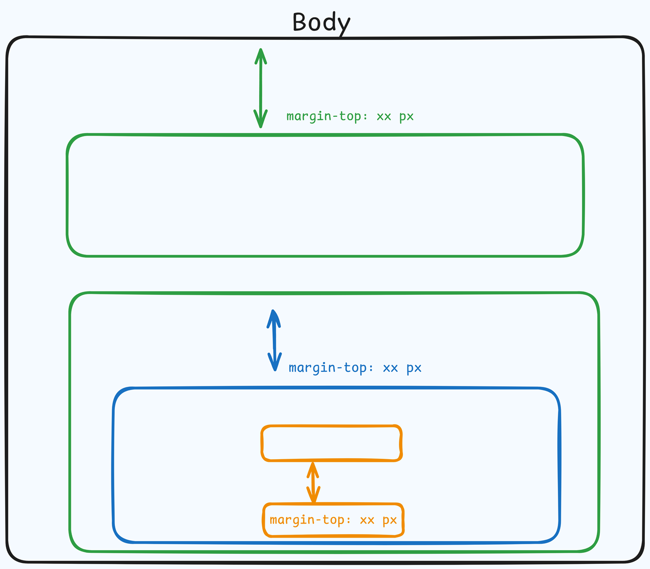
Top Margin
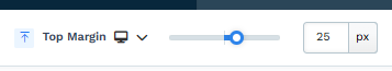 The Top Margin setting lets you control the space between the current container (section, row, flex, and element) and the container directly above it. If no previous container exists, the margin will be applied relative to the parent container. If no preceding container is added, the Body will be the parent.
You can set top margin values independently for desktop and mobile by using the device icons (px) or percentage (%) to create consistent spacing across screen sizes.
Filters
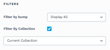
The Filters settings allow you to control which products are displayed:
Filter by Bump: This option works when the Products collection element is used on a funnel page and products have been added to that page. It lets you display only bump products, only non‑bump products, or all products that were added to the funnel page.
Display All: Shows all products, including both bump and non-bump products, added to the funnel page.
Show Only Bump Products: Displays only products marked as bump products to the funnel page.
Show Non-Bump Products: Displays only products not marked as bump products to the funnel page.
Filter by Collection: Show only items from a specific product collection, a group of related products you manage in your store (e.g., “New Arrivals,” “Accessories,” etc.). Choose Current Collection Name when the page already has a collection context (like a collection template); the grid updates automatically as visitors switch collections. Select a Collection to manually pick one from your workspace and lock the grid to that collection.
Note:
On funnel pages, add products to the page so the grid has items to display; otherwise filters (including Filter by Bump) have no effect and the grid won’t render.
“Filter by Collection” controls which products are eligible to appear. Other settings (like pagination and your per‑item elements) control how they appear.
Helpful Resources:
Collection Settings
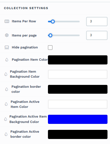
The Collection Settings let you configure how grid items (cards) are arranged and paginated inside the container.
Items Per Row: Choose how many items appear on each row of the grid. The layout will wrap to new rows and adapt on smaller screens automatically.
Items Per Page: Set the total number of items rendered on a single page in the container. If the collection has more than this number, ClickFunnels creates additional pages.
Hide pagination: Turn pagination on or off. When enabled, page-number controls are removed and all eligible items render in one continuous list. For very large collections, consider leaving pagination on to improve load time and navigation.
Pagination Item Color: Color of the pagination items’ text/icons (e.g., the numbers 1, 2, 3).
Pagination Item Background Color: Background color for non‑active pagination items.
Pagination border color: Border color around each pagination item.
Pagination Active Item Color: Text/icon color for the current (active) page item.
Pagination Active Item Background Color: Background color for the active page item.
Pagination Active border color: Border color for the active page item.
Tips:
For accessibility, use pagination colors with sufficient contrast so page numbers remain easy to read.
Advanced Settings
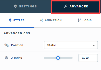
To further customize your container (section, row, column, and element), ClickFunnels provides Advanced settings that allow you to control style, advanced CSS, animation, and rendering logic. We’ve separated these advanced features into dedicated articles to avoid overwhelming you with too much content in one place and to keep our documentation concise. Explore the following resources for more details:
Advanced Settings - Customize Styles: Learn how to populate contents dynamically, position containers, and apply z-index.
Advanced Settings - Customize Animation: Learn how to add animations, control entry and exit effects, and adjust animation delay.
Advanced Settings - Customize Logic: Learn how to apply conditional logic to elements and add custom attributes.
Control Panel
The Control Panel appears at the bottom of every container(Section, Row, Flex, and Element) in the page editor, offering quick access to essential settings and actions for that container. Here’s what each icon represents:.png "image(47).png")
ALL: The container will be visible on all devices (desktop, tablet, and mobile).
Desktop (
🖥️ ) Icon: The container will only be visible in desktop view.Mobile (
📱 ) Icon: The container will only be visible in mobile view.Eye (
👁️ ) Icon: Use this to hide the container from the page. Once clicked, the container will be hidden in the editor but not deleted. You can click the Layout menu in the top navigation bar to find the hidden containers. Select All, Desktop, or Mobile icon to unhide in the editor.Code (</>) Icon: This icon opens the code editor, where you can insert custom CSS or JavaScript code to modify the container's behavior or styling.
Trash (
🗑️ ) Icon: Removes the container from the page editor entirely.