When customers shop online, they frequently face challenges in adequately visualizing products from static images, potentially leading to uncertainty or hesitation during the purchase process. ClickFunnels addresses this by providing the Product Carousel element, which allows customers to smoothly browse multiple product images directly within your checkout page, enhancing their shopping experience. This article explains how to effectively implement and utilize the Product Carousel element within ClickFunnels to improve customer engagement and support informed purchasing decisions..png "image(185).png")
Requirements
An active ClickFunnels account
A funnel page or the store product page
A product created with multiple images
A product attached to the funnel step (for funnels)
A checkout element added to the editor
Upload Images to the Product
Navigate to Products in the side navigation menu.
Select All Products.
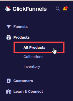
Locate your desired product on the right side. To access its settings, click on the product itself, its image, or the gear
⚙️ icon.Scroll down to the Images section and click Add Images.
Choose multiple images from the image gallery and click Select Images.
.png "image(192).png")
Finally, click Update Product.
Adding a Product Carousel Element in the Page Editor
Inside the page editor, add a Section where you want to place the element.
Add a Row within that section.
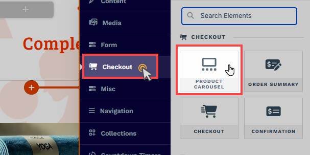
Click the orange + Plus or Add New Element button inside the row to insert a new element.
From the Checkout category, select the Product Carousel element.
Once the Product Carousel element is added, you can customize its appearance to fit your page design.
Customizing Product Carousel Element
When you hover over an element, its border will be highlighted in orange. To access an element's settings, click on the gear ⚙️ icon or click directly on the element.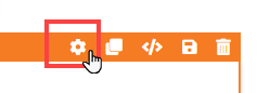
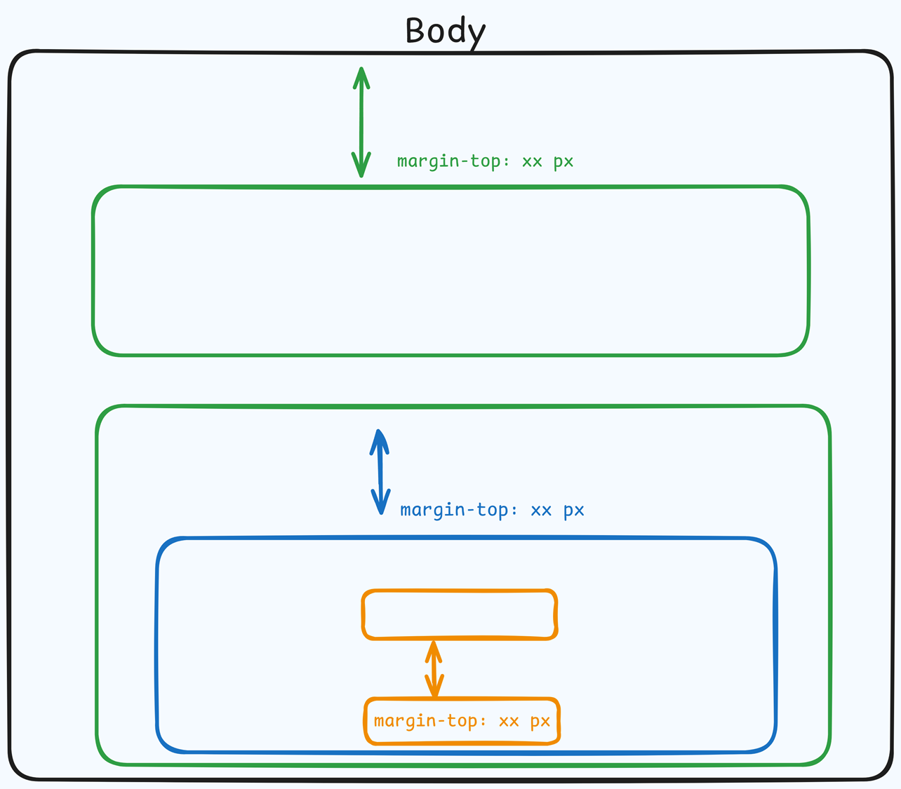
Top Margin
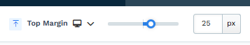 The Top Margin setting lets you control the space between the current container (section, row, flex, and element) and the container directly above it. If no previous container exists, the margin will be applied relative to the parent container. If no preceding container is added, the Body will be the parent.
You can set top margin values independently for desktop and mobile by using the device icons (px) or percentage (%) to create consistent spacing across screen sizes.
Main Image
The Main Image option allows you to adjust the product's main image placeholder that is in view.
.png "image(189).png")
Width & Height: Adjust the width and height of the main image container. You can set the width and height independently for desktop and mobile by using the device icons (
🖥️ & 📱 ). If no mobile value is specified, the mobile settings will inherit the desktop settings by default.Fit: Select how much space the main image should occupy within the container.
Corner: Toggle on and customize the corner styles by adjusting the corner options to add a border radius to the main image container.
Border: Toggle on and customize the border styles by adjusting the border options for the main image container.
Shadow: Toggle on and customize the shadow styles by adjusting the shadow options for the main image container.
Thumbnails
The Thumbnails option allows you to adjust the product thumbnail images placeholder. .png "image(191).png")
Show Thumbnails: Toggle on or off to display or hide the thumbnails in the preview.
Height: Adjust the height of the thumbnail images container.
Mobile Height: Adjust the height of the thumbnail images container for mobile devices.
Number of thumbnails: Choose how many images to display in the thumbnail container.
Space Between Thumbnails: Adjust the spacing between each thumbnail.
Scrollbar bg color: Set the background color of the thumbnail scrollbar.
Navigation color: Change the color of the ‘arrow icons’ used to swipe images left or right.
Fit: Determine how much space the thumbnail images should occupy within the container.
Corner: Toggle to add and adjust the border radius of the thumbnail images container.
Border: Toggle to add and adjust the border styles of the thumbnail images container.
Padding
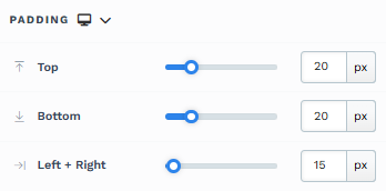
The Padding settings control the space between the content and the inside edge of its container (such as a section, row, column, or element). This internal spacing helps ensure your content has room to breathe and appears visually balanced. Use the slider or manually enter a value in pixels (px) or percentage (%) to create consistent spacing across screen sizes.
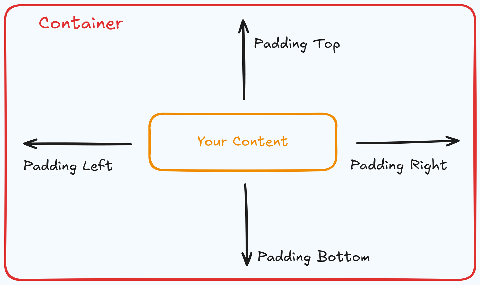
Padding Options:
Top: Add space between the top of the element container and its content.
Bottom: Add space between the bottom of the element container and its content.
Left + Right: Adjust the horizontal spacing between the element container and its content.
Gap: In particular elements, such as the Accordion, the gap property is added to establish spacing between the items within the container. For example, it is possible to adjust the gap between each accordion item within the Accordion element without defining padding at the top and bottom.
Desktop & Mobile (
The padding settings allow you to define separate values for desktop and mobile views. Use the device toggle at the top of the padding controls to switch between screen modes and adjust spacing accordingly. If no mobile value is specified, it will inherit the desktop setting by default.
This feature ensures your layout remains optimized for different screen sizes, enhancing the mobile and desktop experience.
Corner
The Corner settings let you adjust the roundness (border-radius) of an element's corners, providing flexibility to create either rounded or sharp edges:
.png "image(77).png")
Style Presets (1, 2, 3): Choose from predefined corner styles set in your Style Guide. These presets (1, 2, or 3) offer quick styling options that align with your page’s overall design.
Edit Style: To modify a style directly in the Style Guide (affecting all elements using that style), click Edit Style to adjust the preset in your global settings.
Override: To apply custom corner settings without changing the Style Guide, click Override. This allows you to tailor the corner radius for this specific element only.
All Corners: Adjust the slider or enter a specific value in pixels or percentages to set a uniform border radius for all four corners.
Separate Edges: Enable Separate Edges to adjust each corner independently. You can set different values for the Top Left, Top Right, Bottom Left, and Bottom Right corners to achieve unique shapes.
Border
The Border settings enable you to add and style borders around an element, allowing for enhanced visual definition and separation on the page:
.png "image(78).png")
Style Presets (1, 2, 3): Choose from predefined border styles in your Style Guide. These presets provide consistent border styles across your page and can be quickly applied to elements.
Edit Style: To modify the preset border styles in the Style Guide (affecting all elements using that style), select Edit Style to adjust the design in your global settings.
Override: Use the Override option to customize the border settings specifically for this element without impacting the global Style Guide settings.
Borders: Select which sides of the element should display a border. Options include any combination of top, bottom, left, and right borders.
Border Style: To fit your design preferences, choose the border's line style, such as solid, dashed, or dotted.
Color: Use the color picker to select a border color. You can choose a color from the Style Guide or select a custom color, ensuring the border color aligns with your design scheme.
Stroke Size: You can adjust the border's thickness using the Stroke Size slider or by inputting a specific pixel value, creating anything from thin outlines to bold frames.
Shadow
The Shadow settings allow you to add depth and emphasis to elements by applying shadow effects, enhancing the visual appearance. Here’s how to customize shadow properties:
.png "image(79).png")
Style: Select one of the predefined shadow styles from your page's style guide. Click on the numbered styles (1, 2, or 3) to apply preset shadow settings defined in your style guide.
Shadow Style: Choose between Inset (shadow within the element) and Outset (shadow outside the element) to achieve the desired shadow effect.
X-direction: Adjusts the horizontal positioning of the shadow. A positive value moves the shadow to the right, while a negative value shifts it to the left.
Y-direction: Controls the vertical placement of the shadow. Positive values push the shadow downward, while negative values pull it upward.
Blur: Controls the softness of the shadow edges. Higher values create a more diffused, softer shadow, while lower values keep the shadow sharp.
Spread: Adjust the size of the shadow. Positive values expand the shadow, while negative values make it narrower.
Color: Use the color picker to choose to set the shadow color.
Background
The Background section allows you to set the element's background color. You can choose a predefined color from the Style Guide or create a custom color. When using the Custom color picker, you can select the color using the slider or input a specific HEX code..png "image(59).png")
Control Panel
The Control Panel appears at the bottom of every container(Section, Row, Flex, and Element) in the page editor, offering quick access to essential settings and actions for that container. Here’s what each icon represents:.png "image(47).png")
ALL: The container will be visible on all devices (desktop, tablet, and mobile).
Desktop (
🖥️ ) Icon: The container will only be visible in desktop view.Mobile (
📱 ) Icon: The container will only be visible in mobile view.Eye (
👁️ ) Icon: Use this to hide the container from the page. Once clicked, the container will be hidden in the editor but not deleted. You can click the Layout menu in the top navigation bar to find the hidden containers. Select All, Desktop, or Mobile icon to unhide in the editor.Code (</>) Icon: This icon opens the code editor, where you can insert custom CSS or JavaScript code to modify the container's behavior or styling.
Trash (
🗑️ ) Icon: Removes the container from the page editor entirely.
Advanced Settings
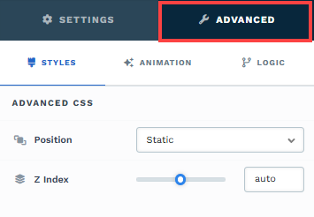
To further customize your container (section, row, column, and element), ClickFunnels provides Advanced settings that allow you to control style, advanced CSS, animation, and rendering logic. We’ve separated these advanced features into dedicated articles to avoid overwhelming you with too much content in one place and to keep our documentation concise. Explore the following resources for more details:
Advanced Settings - Customize Styles: Learn how to populate contents dynamically, position containers, and apply z-index.
Advanced Settings - Customize Animation: Learn how to add animations, control entry and exit effects, and adjust animation delay.
Advanced Settings - Customize Logic: Learn how to apply conditional logic to elements and add custom attributes.
Previewing Product Carousel
Once you’ve set up the checkout page, previewing how it appears on different devices is important. That way, you can make necessary adjustments to ensure a smooth user experience. To preview the product carousel, follow these steps:
In the page editor, navigate to the top right corner and click the Eye
👁️ icon.Alternatively, you can go to the funnel and click on the Page URL in the page thumbnail.
The page will open in a new tab, and the product carousel element will automatically display the product images.
.png "image(193).png")