The Icon element in ClickFunnels allows users to insert icons directly into their pages, enhancing the visual appeal and guiding user attention. Whether highlighting key features or adding visual breaks in your content, this element is a powerful tool for improving user engagement. In this article, you'll learn how to add an Icon to your page and customize its settings.
.png "image(65).png")
Requirements
An active ClickFunnels account
A page created in your workspace
Adding an Icon Element in the Page Editor
Inside the page editor, add a Section where you want to place the element.
Add a Row within that section.
Click the orange + Plus or Add New Element button inside the row to insert a new element.
From the Content category, select the Icon element.
.png "image(64).png")
Once the Icon element is added, you can customize its appearance to fit your page design.
Customizing the Icon Element
When you hover over an element, its border will be highlighted in orange. To access an element's settings, click on the gear ⚙️ icon or click directly on the element.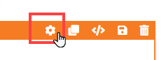
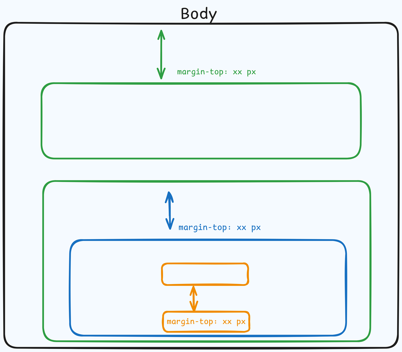
Top Margin
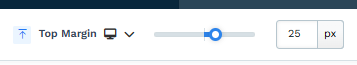 The Top Margin setting lets you control the space between the current container (section, row, flex, and element) and the container directly above it. If no previous container exists, the margin will be applied relative to the parent container. If no preceding container is added, the Body will be the parent.
You can set top margin values independently for desktop and mobile by using the device icons (px) or percentage (%) to create consistent spacing across screen sizes.
Icon Settings
The Icon Settings allow you to adjust the appearance and behavior of the icon on your page. Here’s a breakdown of the settings available: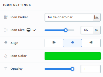
Icon Picker: This option lets you choose an icon from the list. You can select from various icons, such as checkmarks, arrows, or envelopes, to best match your design needs. The icons are loaded from the Font Awesome library, giving you access to numerous icons to fit your design preferences.
Icon Size: Adjust the icon's size to fit your design. Use the slider to increase or decrease the size in px or rem. Set a specific icon size for mobile devices to ensure readability across different screen sizes. This allows independent control of the icon size on mobile devices.
Align: Choose the icon's alignment. Options include left, center, or right alignment to position the icon as needed within its container.
Icon Color: Customize the icon's color to match your branding or page design.
Opacity: Adjust the icon's transparency. A lower opacity creates a faded effect, while a higher opacity keeps the icon fully visible.
Icon Action
The Icon Action setting lets you specify what happens when a user clicks the icon. You can choose from several predefined actions or insert a custom URL. Here’s a breakdown of the available options: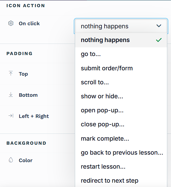
Nothing Happens: Selecting the Nothing Happens option does nothing when clicking the icon.
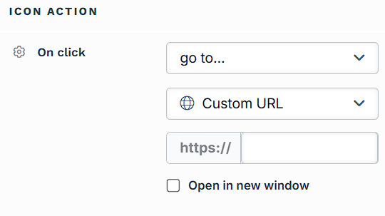
Go to: When you select Go to action, two additional fields will appear, allowing you to choose between Custom URL and Custom Action Link for redirection.
Custom URL: This option lets you enter a specific URL (a “hard link”) to which the icon will redirect upon clicking. This can be an external website or any URL you want to send the user. You may also choose the option "Open in new window." This indicates that when the icon is clicked, the link will open in a new tab in the browser.
Custom Action Link: Instead of linking directly to a hard-coded URL, you can use a relative path or a custom action command (e.g.,
#open-popupor/terms-and-condition). This flexibility allows you to create dynamic links within your page that trigger actions such as opening a pop-up or navigating to a page that matches the path name associated with the same domain. You may also choose the option "Open in new window." This indicates that when the icon is clicked, the link will open in a new tab in the browser.Store Page: This option links directly to your funnel’s connected store front page. It’s useful for icons that need to take users to product listings or shop-related content. You may enable Open in new window to launch the store page in a new tab.
Blog Home Page: This option redirects the user to the main blog page of your site. It’s ideal for promoting or linking back to your blog content. The Open in new window checkbox is also available for this option if you prefer the blog to open in a separate tab.
Submit Form: When you select Submit Order/Form as the icon action, you can control the post-submission redirection with the Enable Redirect Override option:
Default Behavior: If the Enable Redirect Override box is left unchecked, the icon action will follow the default behavior by advancing users to the next step in your ClickFunnels funnel. If the funnel does not have a next step, the form will be submitted, and the page will reload to the current URL.
Enable Redirect Override: By checking this box, you can input a custom URL or a relative path to a page URL in the field. When enabled, the icon will redirect users to this specified URL after the form submission instead of progressing to the next step in the funnel.
Scroll to: Selecting Scroll to as the icon action allows you to create smooth navigation by scrolling to a specific part of the page when the icon is clicked. After selecting Scroll to, a dropdown menu appears where you can choose the target element, such as a Section, Row, or specific Element. For easier identification, you can change the container's title (Section, Row, Flex, and Element) where you want users to scroll. This feature is useful for guiding users to relevant content on the same page, improving the user experience by reducing the need for manual scrolling.
Show/Hide: The Show/Hide action allows you to toggle the visibility of specific elements on the page when the icon is clicked. After selecting Show/Hide, two dropdown menus appear:
Show: Choose elements, sections, or rows that will be displayed when the icon is clicked.
Hide: Select elements, sections, or rows that will be hidden when clicking the icon.
Learn more about showing and hiding content by clicking on a button or icon in the article How to Show / Hide Contents on Button Click.
Open Pop-up: Opens the page pop-up window, which could contain additional information, forms, or calls to action.
Close Pop-up: Closes the active pop-up window.
Mark Complete: Marks the current lesson as complete in a course and automatically advances the user to the next lesson in the sequence.
Go Back to Previous Lesson: Selecting this action allows the user to return to the previously viewed lesson within a course flow. This action does not alter the completion status of the current lesson, making it useful for revisiting earlier content without resetting progress.
Restart Lesson: This action reloads the current lesson and resets all associated progress. It is particularly useful in course lessons where users may need to repeat the material from the beginning for better understanding.
To learn more about editing and customizing course pages, refer to Using the Page Editor to Design Your Course.Redirect to Next Step: When clicking the icon, this action automatically takes the user to the next step in your funnel sequence. It’s a quick way to guide visitors through the funnel progression without manually specifying a URL.
Note:The Redirect to Next Step action is not intended for form submissions. Selecting this action will not submit any form data; it only triggers a redirection to the next funnel step upon clicking. If you need to capture form information before moving users forward, select the Submit Form action instead, as it will properly submit the data and then direct users as specified.
Padding
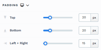
The Padding settings control the space between the content and the inside edge of its container (such as a section, row, column, or element). This internal spacing helps ensure your content has room to breathe and appears visually balanced. Use the slider or manually enter a value in pixels (px) or percentage (%) to create consistent spacing across screen sizes.
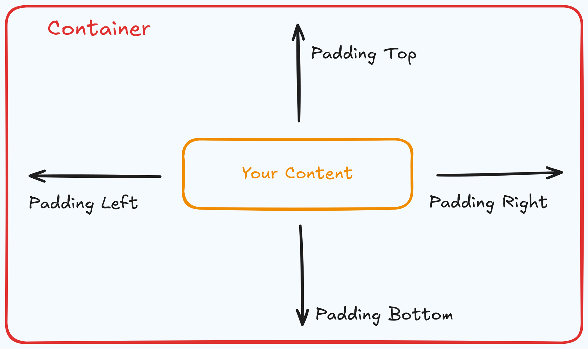
Padding Options:
Top: Add space between the top of the element container and its content.
Bottom: Add space between the bottom of the element container and its content.
Left + Right: Adjust the horizontal spacing between the element container and its content.
Gap: In particular elements, such as the Accordion, the gap property is added to establish spacing between the items within the container. For example, it is possible to adjust the gap between each accordion item within the Accordion element without defining padding at the top and bottom.
Desktop & Mobile (
The padding settings allow you to define separate values for desktop and mobile views. Use the device toggle at the top of the padding controls to switch between screen modes and adjust spacing accordingly. If no mobile value is specified, it will inherit the desktop setting by default.
This feature ensures your layout remains optimized for different screen sizes, enhancing the mobile and desktop experience.
Background
The Background section allows you to set the element's background color. You can choose a predefined color from the Style Guide or create a custom color. When using the Custom color picker, you can select the color using the slider or input a specific HEX code..png "image(59).png")
Control Panel
The Control Panel appears at the bottom of every container(Section, Row, Flex, and Element) in the page editor, offering quick access to essential settings and actions for that container. Here’s what each icon represents:.png "image(47).png")
ALL: The container will be visible on all devices (desktop, tablet, and mobile).
Desktop (
🖥️ ) Icon: The container will only be visible in desktop view.Mobile (
📱 ) Icon: The container will only be visible in mobile view.Eye (
👁️ ) Icon: Use this to hide the container from the page. Once clicked, the container will be hidden in the editor but not deleted. You can click the Layout menu in the top navigation bar to find the hidden containers. Select All, Desktop, or Mobile icon to unhide in the editor.Code (</>) Icon: This icon opens the code editor, where you can insert custom CSS or JavaScript code to modify the container's behavior or styling.
Trash (
🗑️ ) Icon: Removes the container from the page editor entirely.
Advanced Settings
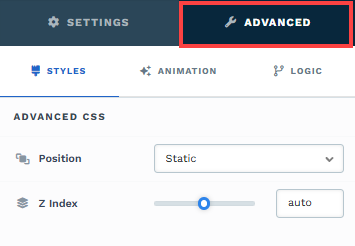
To further customize your container (section, row, column, and element), ClickFunnels provides Advanced settings that allow you to control style, advanced CSS, animation, and rendering logic. We’ve separated these advanced features into dedicated articles to avoid overwhelming you with too much content in one place and to keep our documentation concise. Explore the following resources for more details:
Advanced Settings - Customize Styles: Learn how to populate contents dynamically, position containers, and apply z-index.
Advanced Settings - Customize Animation: Learn how to add animations, control entry and exit effects, and adjust animation delay.
Advanced Settings - Customize Logic: Learn how to apply conditional logic to elements and add custom attributes.