The Link element in ClickFunnels allows you to easily create hyperlinks or navigation links, guiding users to other sections, pages, or external URLs. This element is a versatile alternative to buttons, allowing you to provide clickable text links for various actions like opening pop-ups, submitting forms, or navigating to another page. In this article, you'll learn how to add a Link element to your page and customize its settings for optimal user experience..png "image(68).png")
Requirements
An active ClickFunnels account
A page created in your workspace
Adding a Link Element in the Page Editor
Inside the page editor, add a Section where you want to place the element.
Add a Row within that section.
Click the orange + Plus or Add New Element button inside the row to insert a new element.
From the Content category, select the Link element.
.png "image(67).png")
Once the Link element is added, you can customize its appearance to fit your page design.
Customizing the Link Element
When you hover over an element, its border will be highlighted in orange. To access an element's settings, click on the gear ⚙️ icon or click directly on the element.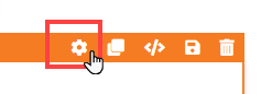
Top Margin
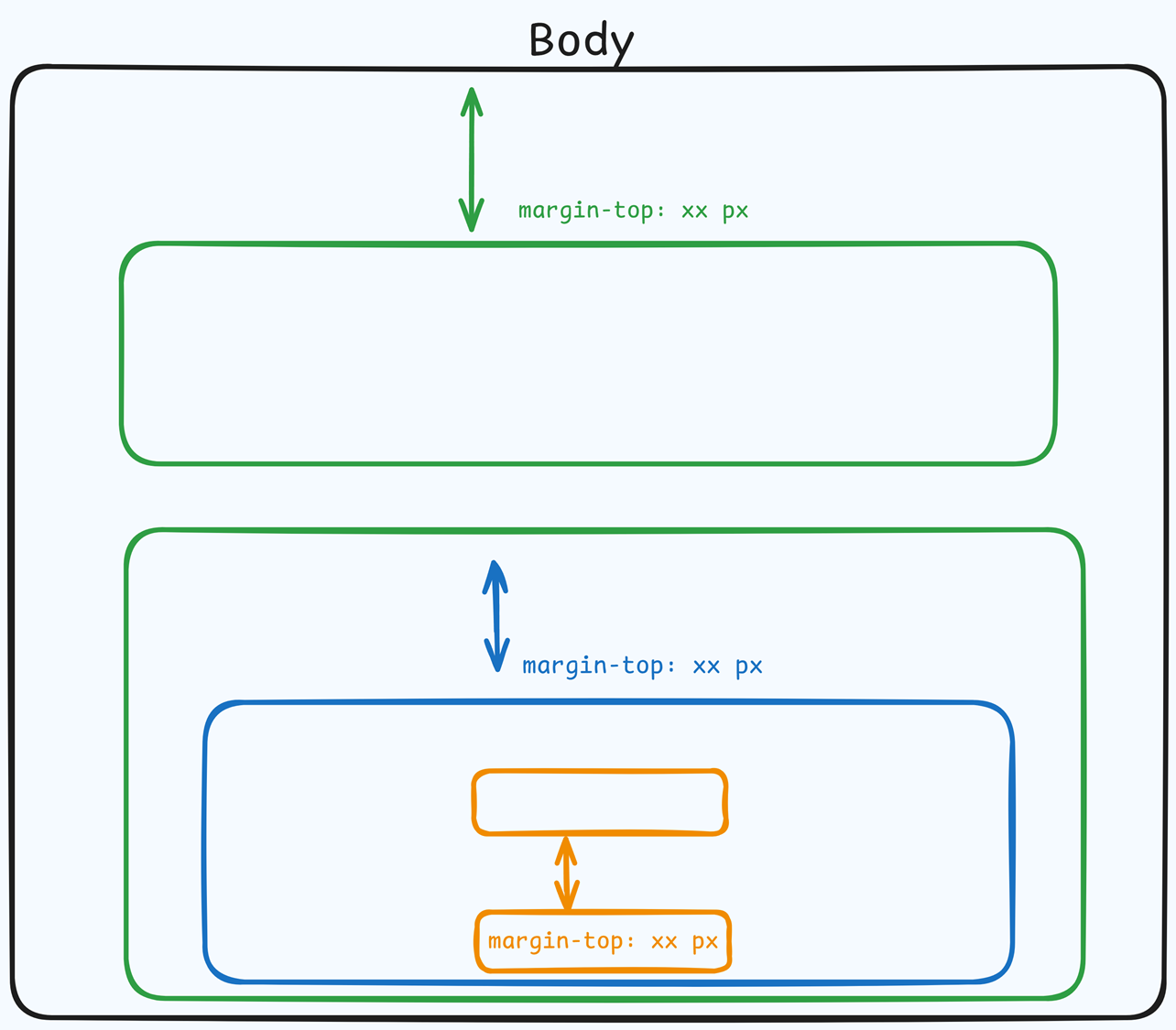
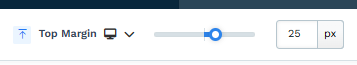 The Top Margin setting lets you control the space between the current container (section, row, flex, and element) and the container directly above it. If no previous container exists, the margin will be applied relative to the parent container. If no preceding container is added, the Body will be the parent.
You can set top margin values independently for desktop and mobile by using the device icons (px) or percentage (%) to create consistent spacing across screen sizes.
Link Settings
The Link Settings allow you to configure the appearance and functionality of your link. Here’s an explanation of the key settings available:
.png "image(69).png")
Link Name: Enter the display text for your link. This is the clickable text users will see on the page.
Link Action or URL: The setting lets you specify what happens when a user clicks the link. You can choose from several predefined actions or insert a custom URL. Here’s a breakdown of the available options:
#open-popup: Clicking the link will trigger the page popup to open.
#submit-form: This option submits an opt-in form when clicking the link.
?next_funnel_step=true: Clicking the link will redirect users to the next page in your funnel.
#close-popup: This action will close an already opened popup, functioning as the opposite of the open popup action.
?page_action=mark_complete: If you're using the link in a course lesson editor, selecting this action will mark the lesson as completed when clicked.
Target: Select whether the link opens in the same or a new window.
Padding
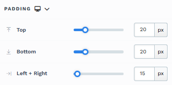
The Padding settings control the space between the content and the inside edge of its container (such as a section, row, column, or element). This internal spacing helps ensure your content has room to breathe and appears visually balanced. Use the slider or manually enter a value in pixels (px) or percentage (%) to create consistent spacing across screen sizes.
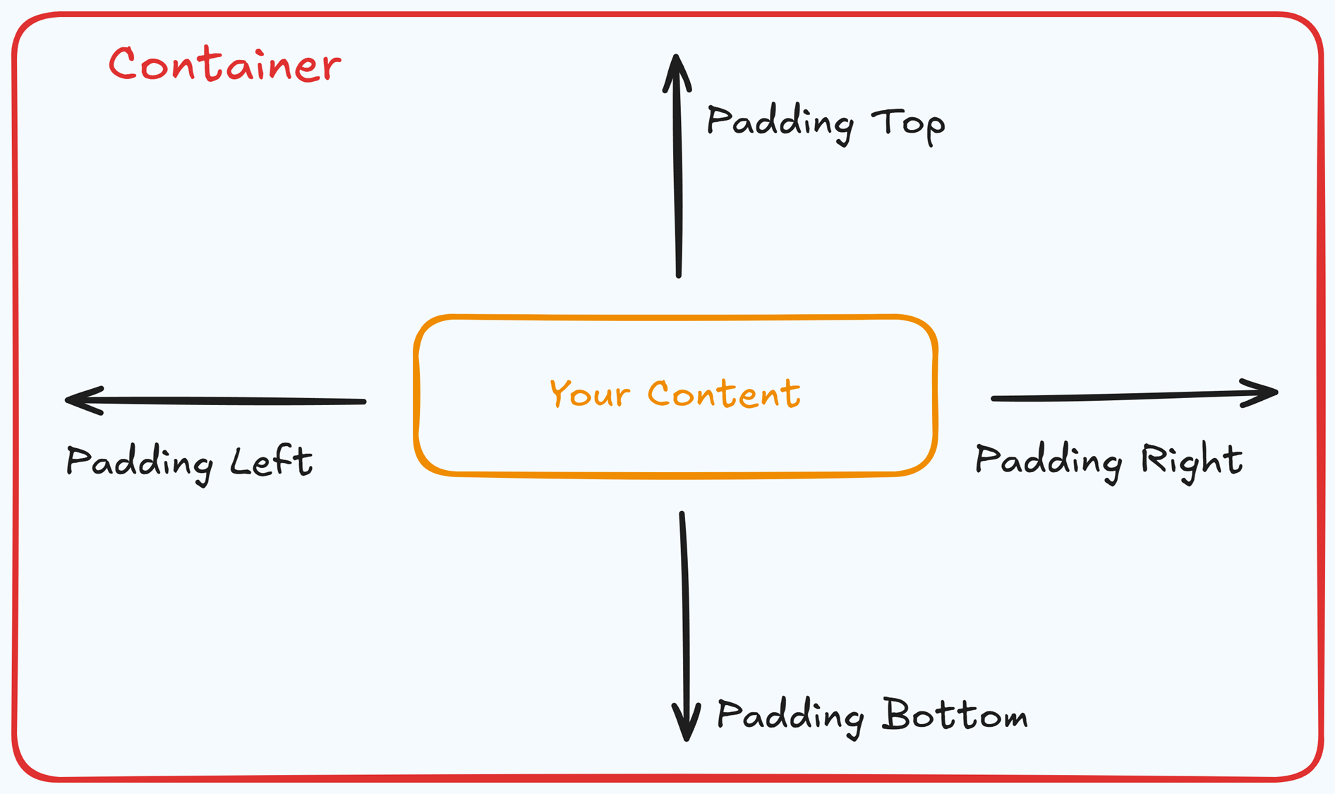
Padding Options:
Top: Add space between the top of the element container and its content.
Bottom: Add space between the bottom of the element container and its content.
Left + Right: Adjust the horizontal spacing between the element container and its content.
Gap: In particular elements, such as the Accordion, the gap property is added to establish spacing between the items within the container. For example, it is possible to adjust the gap between each accordion item within the Accordion element without defining padding at the top and bottom.
Desktop & Mobile (
The padding settings allow you to define separate values for desktop and mobile views. Use the device toggle at the top of the padding controls to switch between screen modes and adjust spacing accordingly. If no mobile value is specified, it will inherit the desktop setting by default.
This feature ensures your layout remains optimized for different screen sizes, enhancing the mobile and desktop experience.
Typography
The Typography settings allow you to control the appearance of text in your element. These settings provide two views. You can select a predefined style (Small, Medium, or Large) that applies a consistent design across your page. If you select to override the predefined style, additional settings become available, allowing you to customize the text appearance manually.
Font Family: This option allows you to select the font type for your text. ClickFunnels provides a range of popular fonts from the Google Fonts library. Additionally, you can upload and use your own custom fonts by navigating to Workspace Settings > My Assets > Fonts. Once uploaded, your custom fonts will appear in the selection list for use.
Weight: This option defines the thickness of the text. Depending on your desired emphasis, you can choose from Thin, Regular, or Bold options. Thin fonts provide a subtle look, while bold fonts create more visual impact.
Font Size: You can adjust the text size using the slider or manually inputting a specific value. Additionally, you can choose between rem or px for the size measurement, such as 2rem or 32px. You can also set font size values independently for desktop and mobile by using the device icons (
🖥️ & 📱 ).Rem is a relative unit based on the base font size defined in your style guide. For example, if you select a text size of 2rem and your style guide specifies a base font size of 16px for desktop, the resulting text size will be 32px for desktop view (i.e., 2rem × 16px = 32px).
Px is an absolute measurement, providing precise control over the text size.
Letter Spacing: Adjust the space between individual letters. You can increase or decrease the value using the slider or input a specific value (measured in rem). More spacing spreads the letters apart, while less spacing brings them closer together. You can also set letter spacing values independently for desktop and mobile by using the device icons (
🖥️ & 📱 ).Line Height: Controls the vertical space between lines of text. This is typically expressed as a percentage of the font size. A higher percentage increases the space between lines, improving readability, especially for larger blocks of text. You can also set line height values independently for desktop and mobile by using the device icons (
🖥️ & 📱 ).Color: Use the color picker to select the text color. You can choose a predefined color from the Style Guide or create a custom color. When using the Custom color picker, you can select the color using the slider or input a specific HEX code. Additionally, you can adjust the opacity (Alpha value) using the second slider—moving it to the left reduces the opacity and makes the color more transparent, while moving it to the right makes it fully opaque.
Bold: Similar to the Color option, you can select a color for the bold state of the text. This color will be applied when the text is set to bold, allowing you to differentiate it visually from regular text.
Link: Like the Color option, you can apply a specific color to text containing a hyperlink. If the text is hyperlinked, the selected color will be used to style the link, helping to make it stand out.
Icon Color: Choose the color of your icons (if applicable) to ensure they match your overall page design.
Text Casing: Select how your text should appear in terms of capitalization:
Lowercase: All text in lowercase.
Uppercase: All text in uppercase.
Capitalize: Capitalize the first letter of each word.
Decoration: Add text decorations such as:
Underline: Draw a line beneath your text.
Strikethrough: Cross out your text with a horizontal line.
Overline: Draw a line above your text.
Opacity: Adjust the opacity of the text. The slider allows you to make the text more or less transparent. Moving the slider to the left (0) decreases the opacity (making the text more transparent), while moving it to the right (1) makes the text fully opaque.
Align: Set the alignment of your text within its container. Based on your page design, you can choose to align the text to the left, center, or right.
Background
The Background section allows you to set the element's background color. You can choose a predefined color from the Style Guide or create a custom color. When using the Custom color picker, you can select the color using the slider or input a specific HEX code..png "image(59).png")
Text Shadow
The Text Shadow section adds a subtle shadow behind your text, creating depth and improving readability. You can control the following parameters:
.png "image(60).png")
Offset-x and Offset-y: Adjust the horizontal and vertical positioning of the shadow.
Blur: Set how blurred or sharp the shadow appears.
Color: Choose the shadow color to match or contrast your page design.
Control Panel
The Control Panel appears at the bottom of every container(Section, Row, Flex, and Element) in the page editor, offering quick access to essential settings and actions for that container. Here’s what each icon represents:.png "image(47).png")
ALL: The container will be visible on all devices (desktop, tablet, and mobile).
Desktop (
🖥️ ) Icon: The container will only be visible in desktop view.Mobile (
📱 ) Icon: The container will only be visible in mobile view.Eye (
👁️ ) Icon: Use this to hide the container from the page. Once clicked, the container will be hidden in the editor but not deleted. You can click the Layout menu in the top navigation bar to find the hidden containers. Select All, Desktop, or Mobile icon to unhide in the editor.Code (</>) Icon: This icon opens the code editor, where you can insert custom CSS or JavaScript code to modify the container's behavior or styling.
Trash (
🗑️ ) Icon: Removes the container from the page editor entirely.
Advanced Settings
To further customize your container (section, row, column, and element), ClickFunnels provides Advanced settings that allow you to control style, advanced CSS, animation, and rendering logic. We’ve separated these advanced features into dedicated articles to avoid overwhelming you with too much content in one place and to keep our documentation concise. Explore the following resources for more details:
Advanced Settings - Customize Styles: Learn how to populate contents dynamically, position containers, and apply z-index.
Advanced Settings - Customize Animation: Learn how to add animations, control entry and exit effects, and adjust animation delay.
Advanced Settings - Customize Logic: Learn how to apply conditional logic to elements and add custom attributes.