Long pages with extensive content can overwhelm and confuse your visitors, making it challenging to find specific information quickly. ClickFunnels solves this issue with the Accordion element, which neatly organizes content into expandable and collapsible sections, enhancing clarity and readability. In this article, you'll learn how to add and customize the Accordion element to organize content clearly and efficiently.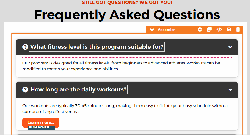
Requirements
An active ClickFunnels account
A page created in your workspace
How the Accordion Feature Works
The term "accordion" originates from the musical instrument known as an accordion, which expands and collapses to produce sound when played. Similarly, an accordion component expands to show content and collapses to hide it, allowing information to be neatly tucked away when not needed. Just as the musical accordion reveals its bellows as it stretches, the accordion component clearly displays its content when expanded, making it easy for visitors to view detailed information without overwhelming the page.
ClickFunnels provides a built-in Accordion element in the page editor as a user-friendly, no-code solution. You can organize your webpage content into expandable and collapsible sections, letting users interactively show or hide information by clicking on the headers.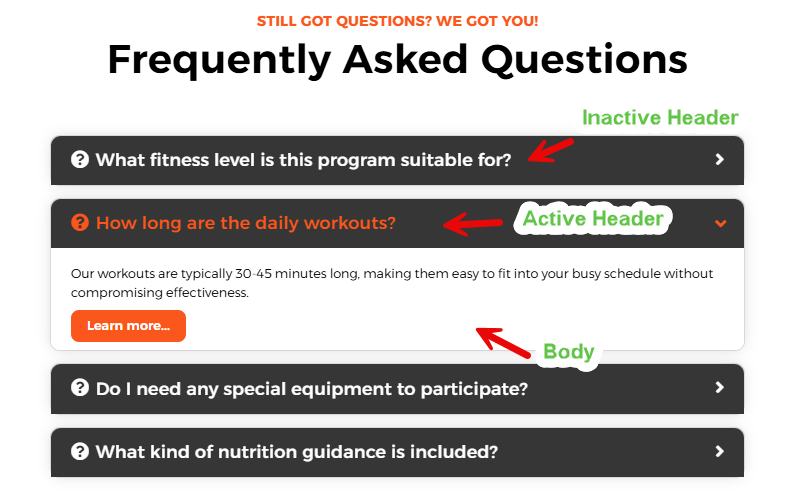
When to Use the Accordion Element
Use the Accordion element whenever you have content that can be logically grouped into sections. Common uses include:
Frequently Asked Questions (FAQs)
Product details or specifications
Policies and terms
Step-by-step instructions or processes
Adding the Accordion Element in the Page Editor
Inside the page editor, add a Section where you want to place the element.
Add a Row within that section.
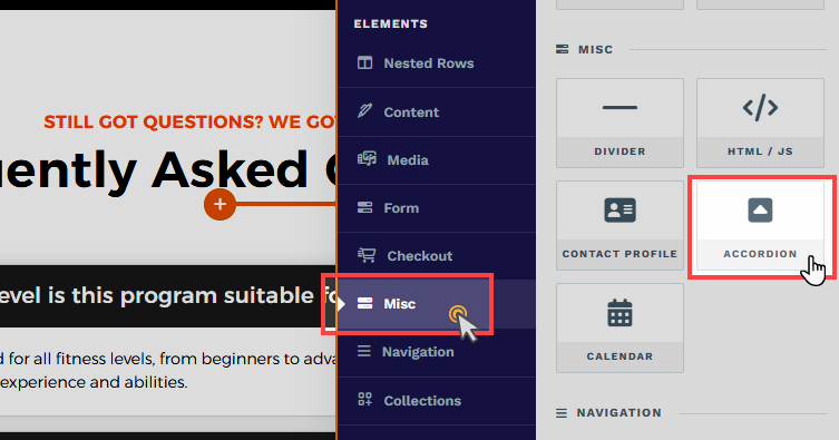
Click the orange + Plus or Add New Element button inside the row to insert a new element.
From the Misc (Miscellaneous) category, select the Accordion element.
Once the Accordion element is added, you can customize its appearance to fit your page design.
Managing Contents in the Accordion Element
The Accordion element consists of individual Accordion items. Each item is a container with two primary parts: a Header and a Body. The Header is a text block where you directly type titles or headings, while the Body is a content area where you can add elements such as paragraphs, videos, buttons, and more. When you insert an Accordion element, ClickFunnels automatically adds three default Accordion items.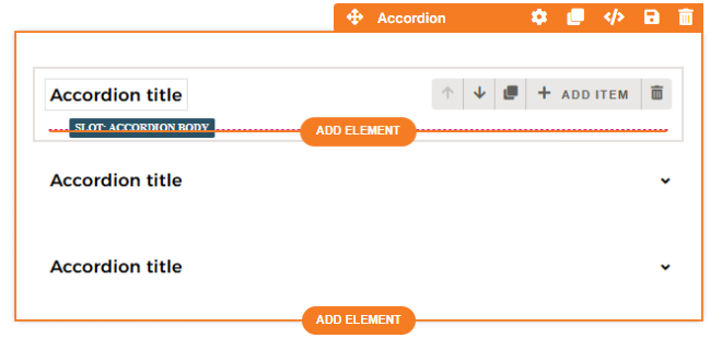
Editing Header
Click directly on the accordion title to edit the Header text.
Adding Body Contents
Hovering over an Accordion item allows you to add editor elements such as headlines, paragraphs, videos, buttons, and more. Click the Add Element button to insert the contents.
Adding New Item
Click the + Add Item button to add a new item in the Accordion element. By default, ClickFunnels includes three items, each containing a header and body.
Cloning an Existing Item
Click the Clone
Removing an Item
Click the Trash
Arranging Items
Use the arrow (
Customizing the Accordion Element
When you hover over an element, its border will be highlighted in orange. To access an element's settings, click on the gear ⚙️ icon or click directly on the element.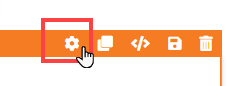
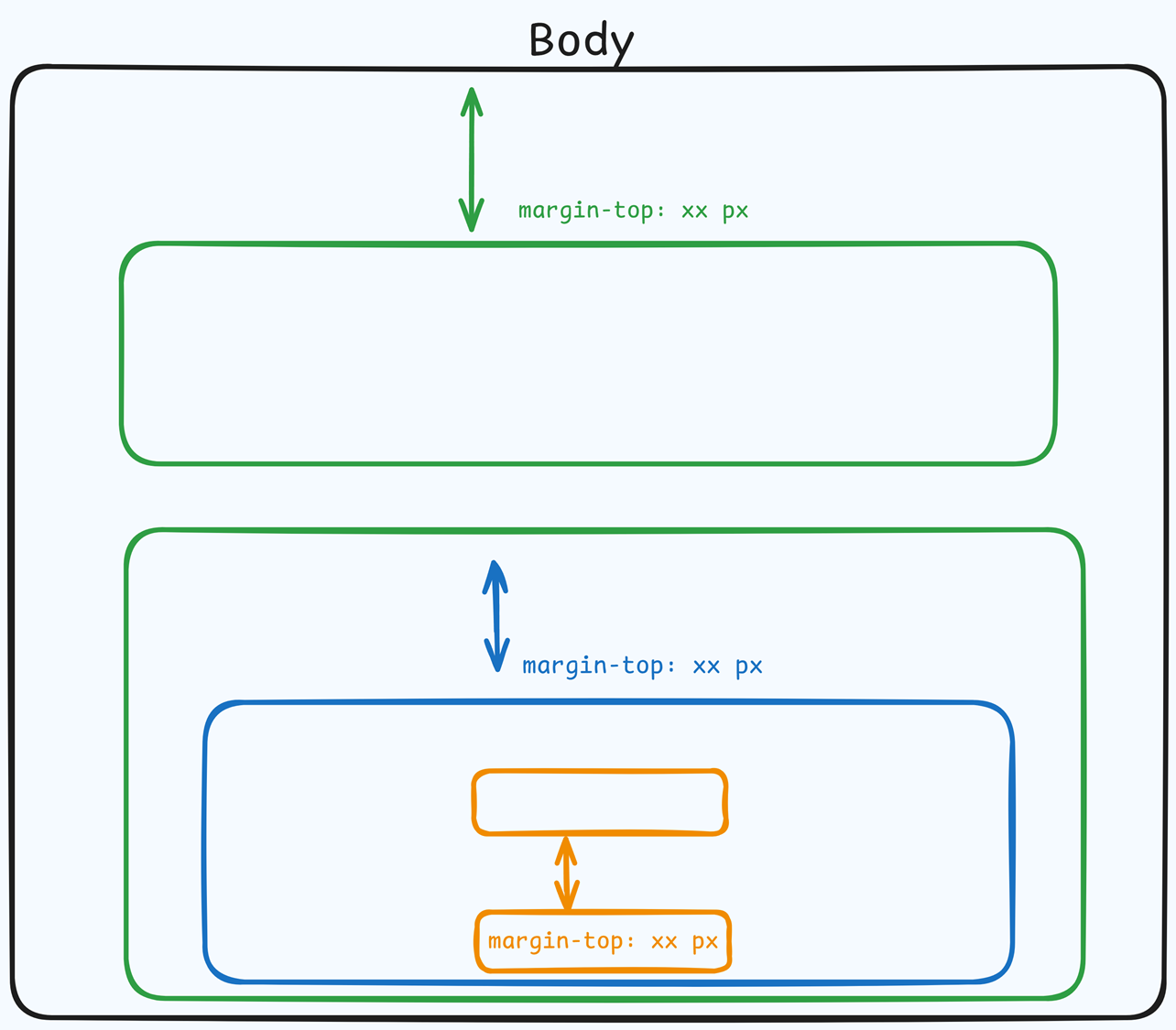
Top Margin
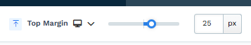 The Top Margin setting lets you control the space between the current container (section, row, flex, and element) and the container directly above it. If no previous container exists, the margin will be applied relative to the parent container. If no preceding container is added, the Body will be the parent.
You can set top margin values independently for desktop and mobile by using the device icons (px) or percentage (%) to create consistent spacing across screen sizes.
Accordion Item Settings
Preview
At the top of the Accordion Item Settings panel, you can preview the Accordion in either the Open or Closed Accordion state. Selecting "Open Accordion" expands all Accordion items, showing the content within, while selecting "Closed Accordion" collapses all items, giving you an immediate visual reference of how your Accordion will appear to visitors in different states.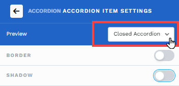
Item Border, Shadow, and Corner
Enhance the visual appearance of your Accordion items by utilizing the Border, Shadow, and Corner settings.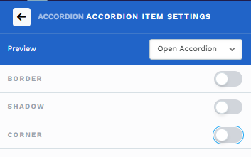
Border: Enable borders to define and emphasize Accordion items clearly. Choose from pre-set styles or customize individual border attributes like style (solid, dashed, dotted), position, color, and stroke size to align perfectly with your design.
Shadow: Activate shadows to add depth and dimension, making Accordion items visually distinct. Select from available shadow presets or create customized shadow effects for added aesthetic appeal.
Corner: Use corner options to refine the overall appearance of Accordion items. You can select predefined styles, such as square or rounded corners, or adjust the corner radius precisely to match your visual preferences. This option also allows overriding global styles to suit unique design needs.
Body Padding
Adjust internal spacing within each Accordion body for optimal content presentation. Control padding individually for the top, bottom, and sides to ensure readability and visual comfort. Click on the desktop and mobile icons to modify the padding for both desktop and mobile displays. You can set padding values independently for desktop and mobile by using the device icons (px) or percentage (%) to create consistent spacing across screen sizes.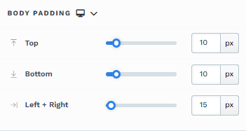
Body Background
Choose a background color for the content area of Accordion items, helping to differentiate content sections visually.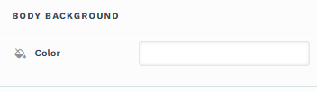
Header Padding
Adjust the padding individually for the header text's top, bottom, and sides to manage the spacing and ensure clear readability. Click on the desktop and mobile icons to modify the padding for both desktop and mobile displays. You can set padding values independently for desktop and mobile by using the device icons (px) or percentage (%) to create consistent spacing across screen sizes.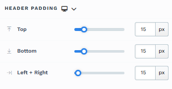
Header Colors
Customize colors for Accordion headers to indicate different interaction states. Select each state and adjust the color according to your preference: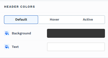
Default: Standard appearance.
Hover: When the cursor moves over the header.
Active: When the Accordion item is expanded.
Style Guide Options
Select a base style guide to ensure alignment with your selected style guide on the page. The Typography settings will automatically adjust the font properties based on your base style selection. For instance, if you select Sub Headline, the properties associated with Sub Headline from the page style guide will be applied in the Typography settings. Further adjustments may be made in the Typography section.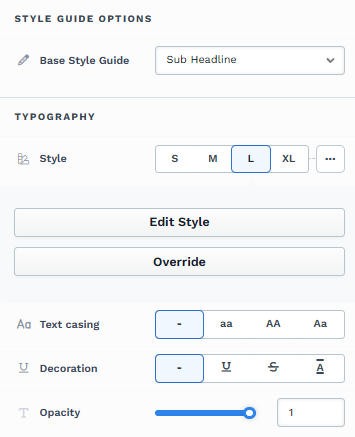
Typography
Customize font family, weight, size (desktop and mobile), letter spacing, line height, text casing, decoration, and opacity in accordion headers to refine text appearance and improve clarity and visual impact. You can utilize the global style guide by selecting a pre-defined style or clicking Override to change the default configurations.
Icon Settings
Enhance Accordion headers with icons for visual cues: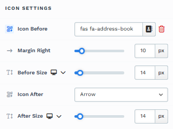
Icon Before: The Icon Before feature lets you add an icon at the start of your header text to represent the content effectively. After selecting an icon, you can adjust its size by modifying the Before Size and Before Size Mobile settings, and you can also fine-tune the right spacing with the Margin Right property to ensure proper alignment and visual balance.
Icon After: The Icon After setting adds an icon at the end of your header text to indicate that the Accordion item can be expanded or collapsed. You can select from options such as a downward-pointing arrow (commonly used to suggest expandable content), a plus sign to emphasize interactivity, or opt for no icon if you prefer a minimalist style. Further adjustments allow customizing the icon size for desktop and mobile views, ensuring a consistent and responsive user experience.
You can set icon before and after sizes independently for desktop and mobile by using the device icons (
Padding
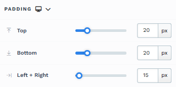
The Padding settings control the space between the content and the inside edge of its container (such as a section, row, column, or element). This internal spacing helps ensure your content has room to breathe and appears visually balanced. Use the slider or manually enter a value in pixels (px) or percentage (%) to create consistent spacing across screen sizes.
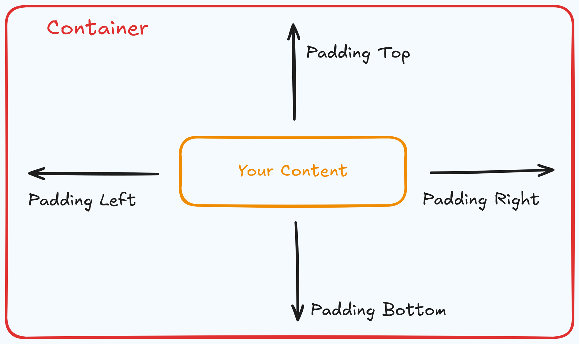
Padding Options:
Top: Add space between the top of the element container and its content.
Bottom: Add space between the bottom of the element container and its content.
Left + Right: Adjust the horizontal spacing between the element container and its content.
Gap: In particular elements, such as the Accordion, the gap property is added to establish spacing between the items within the container. For example, it is possible to adjust the gap between each accordion item within the Accordion element without defining padding at the top and bottom.
Desktop & Mobile (
The padding settings allow you to define separate values for desktop and mobile views. Use the device toggle at the top of the padding controls to switch between screen modes and adjust spacing accordingly. If no mobile value is specified, it will inherit the desktop setting by default.
This feature ensures your layout remains optimized for different screen sizes, enhancing the mobile and desktop experience.
Border
The Border settings enable you to add and style borders around an element, allowing for enhanced visual definition and separation on the page:
.png "image(78).png")
Style Presets (1, 2, 3): Choose from predefined border styles in your Style Guide. These presets provide consistent border styles across your page and can be quickly applied to elements.
Edit Style: To modify the preset border styles in the Style Guide (affecting all elements using that style), select Edit Style to adjust the design in your global settings.
Override: Use the Override option to customize the border settings specifically for this element without impacting the global Style Guide settings.
Borders: Select which sides of the element should display a border. Options include any combination of top, bottom, left, and right borders.
Border Style: To fit your design preferences, choose the border's line style, such as solid, dashed, or dotted.
Color: Use the color picker to select a border color. You can choose a color from the Style Guide or select a custom color, ensuring the border color aligns with your design scheme.
Stroke Size: You can adjust the border's thickness using the Stroke Size slider or by inputting a specific pixel value, creating anything from thin outlines to bold frames.
Shadow
The Shadow settings allow you to add depth and emphasis to elements by applying shadow effects, enhancing the visual appearance. Here’s how to customize shadow properties:
.png "image(79).png")
Style: Select one of the predefined shadow styles from your page's style guide. Click on the numbered styles (1, 2, or 3) to apply preset shadow settings defined in your style guide.
Shadow Style: Choose between Inset (shadow within the element) and Outset (shadow outside the element) to achieve the desired shadow effect.
X-direction: Adjusts the horizontal positioning of the shadow. A positive value moves the shadow to the right, while a negative value shifts it to the left.
Y-direction: Controls the vertical placement of the shadow. Positive values push the shadow downward, while negative values pull it upward.
Blur: Controls the softness of the shadow edges. Higher values create a more diffused, softer shadow, while lower values keep the shadow sharp.
Spread: Adjust the size of the shadow. Positive values expand the shadow, while negative values make it narrower.
Color: Use the color picker to choose to set the shadow color.
Corner
The Corner settings let you adjust the roundness (border-radius) of an element's corners, providing flexibility to create either rounded or sharp edges:
.png "image(77).png")
Style Presets (1, 2, 3): Choose from predefined corner styles set in your Style Guide. These presets (1, 2, or 3) offer quick styling options that align with your page’s overall design.
Edit Style: To modify a style directly in the Style Guide (affecting all elements using that style), click Edit Style to adjust the preset in your global settings.
Override: To apply custom corner settings without changing the Style Guide, click Override. This allows you to tailor the corner radius for this specific element only.
All Corners: Adjust the slider or enter a specific value in pixels or percentages to set a uniform border radius for all four corners.
Separate Edges: Enable Separate Edges to adjust each corner independently. You can set different values for the Top Left, Top Right, Bottom Left, and Bottom Right corners to achieve unique shapes.
Control Panel
The Control Panel appears at the bottom of every container(Section, Row, Flex, and Element) in the page editor, offering quick access to essential settings and actions for that container. Here’s what each icon represents:.png "image(47).png")
ALL: The container will be visible on all devices (desktop, tablet, and mobile).
Desktop (
🖥️ ) Icon: The container will only be visible in desktop view.Mobile (
📱 ) Icon: The container will only be visible in mobile view.Eye (
👁️ ) Icon: Use this to hide the container from the page. Once clicked, the container will be hidden in the editor but not deleted. You can click the Layout menu in the top navigation bar to find the hidden containers. Select All, Desktop, or Mobile icon to unhide in the editor.Code (</>) Icon: This icon opens the code editor, where you can insert custom CSS or JavaScript code to modify the container's behavior or styling.
Trash (
🗑️ ) Icon: Removes the container from the page editor entirely.
Advanced Settings
To further customize your container (section, row, column, and element), ClickFunnels provides Advanced settings that allow you to control style, advanced CSS, animation, and rendering logic. We’ve separated these advanced features into dedicated articles to avoid overwhelming you with too much content in one place and to keep our documentation concise. Explore the following resources for more details:
Advanced Settings - Customize Styles: Learn how to populate contents dynamically, position containers, and apply z-index.
Advanced Settings - Customize Animation: Learn how to add animations, control entry and exit effects, and adjust animation delay.
Advanced Settings - Customize Logic: Learn how to apply conditional logic to elements and add custom attributes.