The Divider element in ClickFunnels is designed to add separation and structure within your page content. It allows you to create clear boundaries or subtle spacing to improve readability and organization on your page. With customization options for styling, alignment, and spacing, the Divider element can be used to visually break up content blocks or act as an invisible spacer for smoother transitions. This guide will walk you through the settings and customization options of the Divider element, showing you how to optimize it for your page layout..png "image(281).png")
Requirements
An active ClickFunnels account
A page created in your workspace
Adding a Divider Element in the Page Editor
Inside the page editor, add a Section where you want to place the element.
Add a Row within that section.
Click the orange + Plus or Add New Element button inside the row to insert a new element.
From the MISC (Miscellaneous) category, select the Divider element.
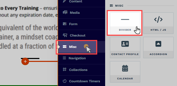
Once the Divider element is added, you can customize its appearance to fit your page design.
Customizing the Divider Element
When you hover over an element, its border will be highlighted in orange. To access an element's settings, click on the gear ⚙️ icon or click directly on the element.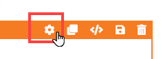
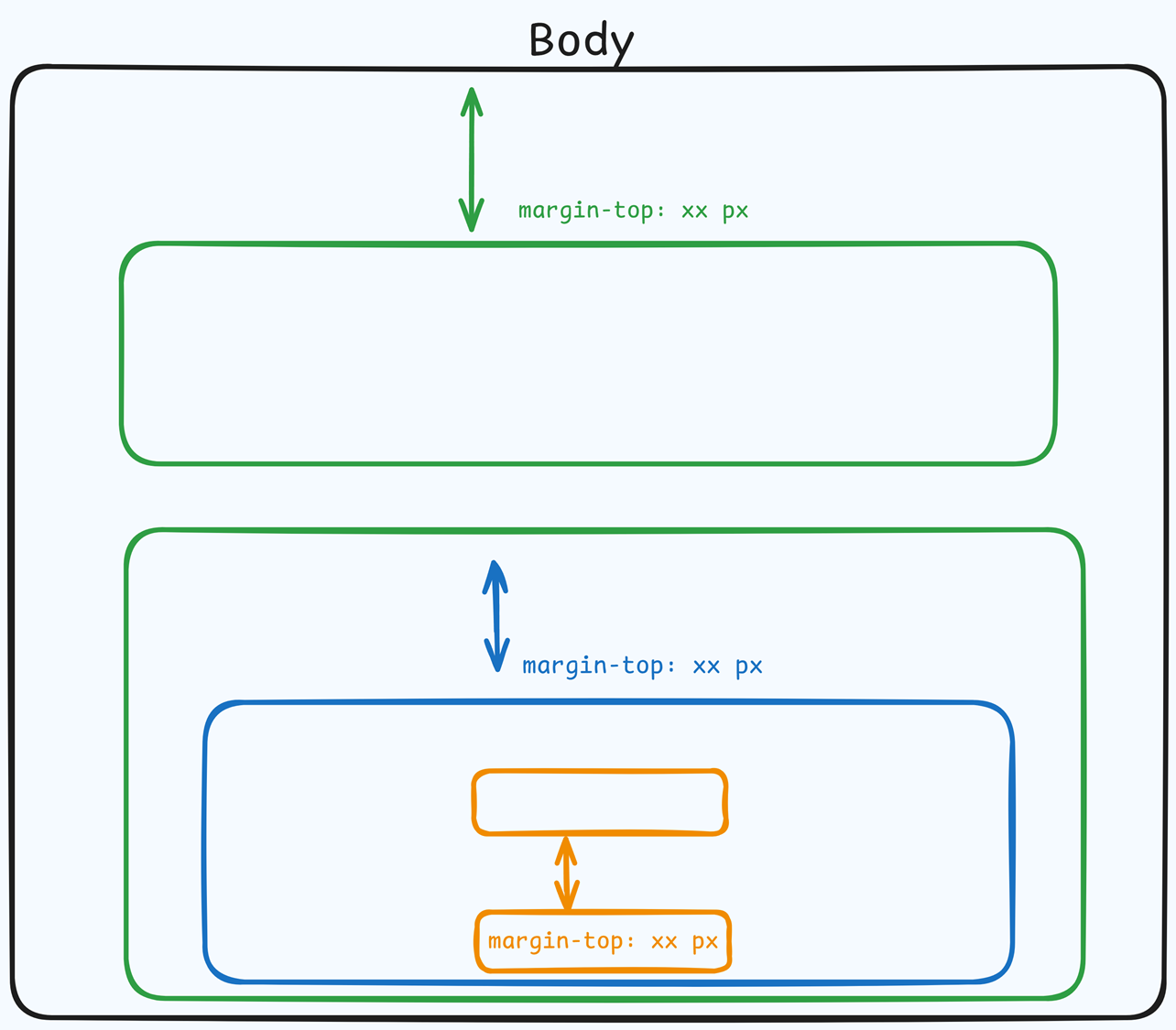
Top Margin
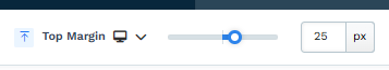 The Top Margin setting lets you control the space between the current container (section, row, flex, and element) and the container directly above it. If no previous container exists, the margin will be applied relative to the parent container. If no preceding container is added, the Body will be the parent.
You can set top margin values independently for desktop and mobile by using the device icons (px) or percentage (%) to create consistent spacing across screen sizes.
Divider Settings
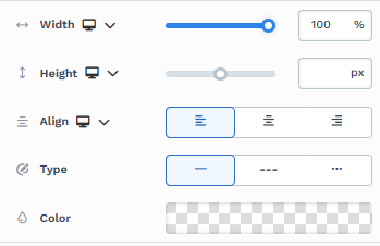
Width: Control the width of the divider relative to the container. Setting it to 100% will span the entire container width while reducing the value will shorten the divider within the container. You can set the width independently for desktop and mobile by using the device icons (
🖥️ & 📱 ). If no mobile value is specified, it will inherit the desktop setting by default. Use the slider or manually enter a value in pixels (px) or percentage (%) to create consistent spacing across screen sizes.Height: Define the height of the divider for a bolder line or a more subtle appearance. You can also set the color to transparent and increase the height to create an invisible spacer that adds spacing without a visible line. You can set the height independently for desktop and mobile by using the device icons (
🖥️ & 📱 ). If no mobile value is specified, it will inherit the desktop setting by default. Use the slider or manually enter a value in pixels (px) or percentage (%) to create consistent spacing across screen sizes.Align: You can choose to align the divider to the left, center, or right within the row. This setting is particularly useful for dividers with less than 100% width. You can set the alignment independently for desktop and mobile by using the device icons (
🖥️ & 📱 ). If no mobile value is specified, it will inherit the desktop setting by default. Use the slider or manually enter a value in pixels (px) or percentage (%) to create consistent spacing across screen sizes.Type: Select from different line styles, such as solid, dashed, or dotted, to match the theme of your page.
Color: Choose a color for the divider line that stands out or blends seamlessly with your page design. To create invisible dividers, simply set the color to transparent.
Padding
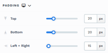
The Padding settings control the space between the content and the inside edge of its container (such as a section, row, column, or element). This internal spacing helps ensure your content has room to breathe and appears visually balanced. Use the slider or manually enter a value in pixels (px) or percentage (%) to create consistent spacing across screen sizes.
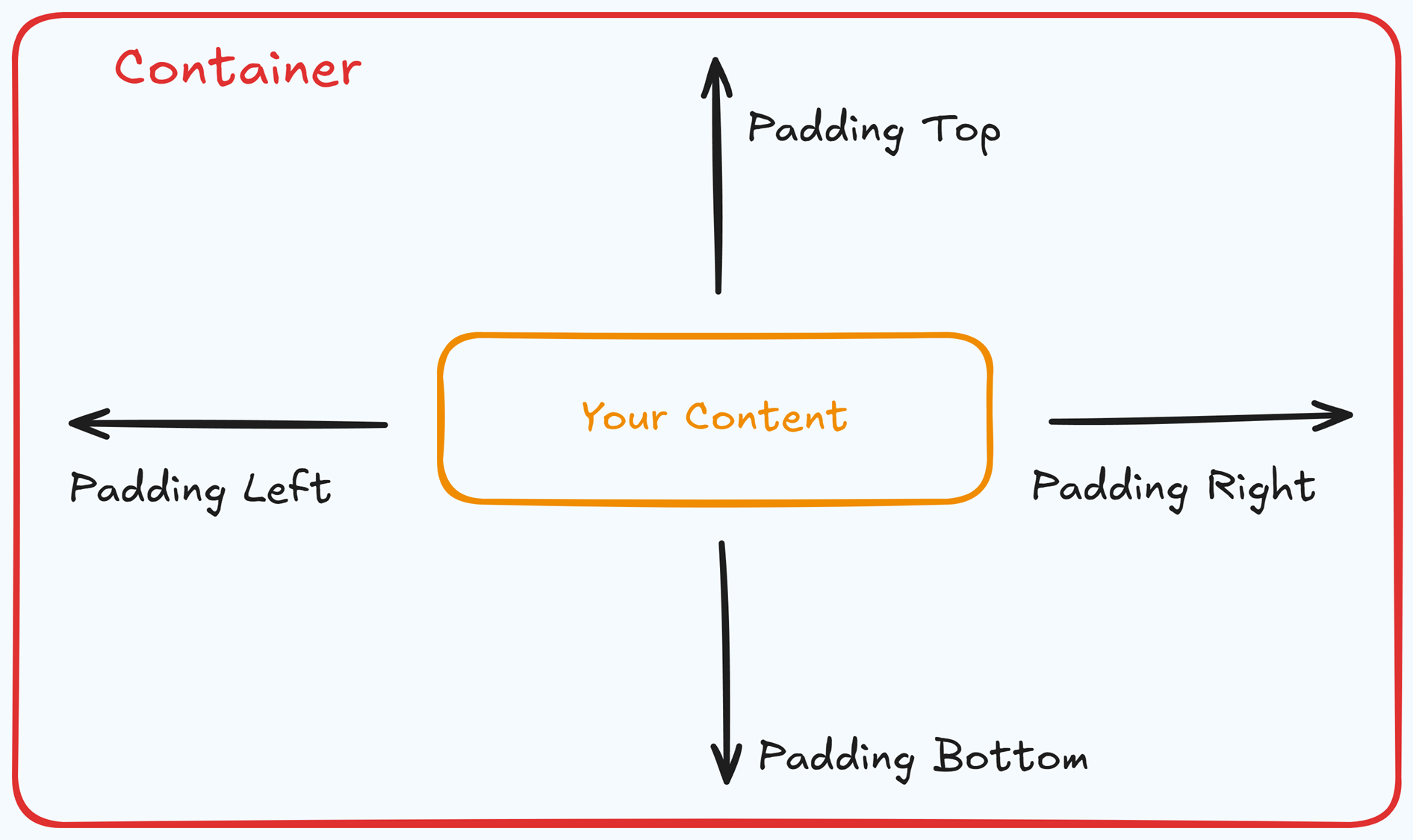
Padding Options:
Top: Add space between the top of the element container and its content.
Bottom: Add space between the bottom of the element container and its content.
Left + Right: Adjust the horizontal spacing between the element container and its content.
Gap: In particular elements, such as the Accordion, the gap property is added to establish spacing between the items within the container. For example, it is possible to adjust the gap between each accordion item within the Accordion element without defining padding at the top and bottom.
Desktop & Mobile (
The padding settings allow you to define separate values for desktop and mobile views. Use the device toggle at the top of the padding controls to switch between screen modes and adjust spacing accordingly. If no mobile value is specified, it will inherit the desktop setting by default.
This feature ensures your layout remains optimized for different screen sizes, enhancing the mobile and desktop experience.
Shadow
The Shadow settings allow you to add depth and emphasis to elements by applying shadow effects, enhancing the visual appearance. Here’s how to customize shadow properties:
.png "image(79).png")
Style: Select one of the predefined shadow styles from your page's style guide. Click on the numbered styles (1, 2, or 3) to apply preset shadow settings defined in your style guide.
Shadow Style: Choose between Inset (shadow within the element) and Outset (shadow outside the element) to achieve the desired shadow effect.
X-direction: Adjusts the horizontal positioning of the shadow. A positive value moves the shadow to the right, while a negative value shifts it to the left.
Y-direction: Controls the vertical placement of the shadow. Positive values push the shadow downward, while negative values pull it upward.
Blur: Controls the softness of the shadow edges. Higher values create a more diffused, softer shadow, while lower values keep the shadow sharp.
Spread: Adjust the size of the shadow. Positive values expand the shadow, while negative values make it narrower.
Color: Use the color picker to choose to set the shadow color.
Control Panel
The Control Panel appears at the bottom of every container(Section, Row, Flex, and Element) in the page editor, offering quick access to essential settings and actions for that container. Here’s what each icon represents:.png "image(47).png")
ALL: The container will be visible on all devices (desktop, tablet, and mobile).
Desktop (
🖥️ ) Icon: The container will only be visible in desktop view.Mobile (
📱 ) Icon: The container will only be visible in mobile view.Eye (
👁️ ) Icon: Use this to hide the container from the page. Once clicked, the container will be hidden in the editor but not deleted. You can click the Layout menu in the top navigation bar to find the hidden containers. Select All, Desktop, or Mobile icon to unhide in the editor.Code (</>) Icon: This icon opens the code editor, where you can insert custom CSS or JavaScript code to modify the container's behavior or styling.
Trash (
🗑️ ) Icon: Removes the container from the page editor entirely.
Advanced Settings
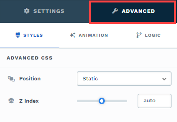
To further customize your container (section, row, column, and element), ClickFunnels provides Advanced settings that allow you to control style, advanced CSS, animation, and rendering logic. We’ve separated these advanced features into dedicated articles to avoid overwhelming you with too much content in one place and to keep our documentation concise. Explore the following resources for more details:
Advanced Settings - Customize Styles: Learn how to populate contents dynamically, position containers, and apply z-index.
Advanced Settings - Customize Animation: Learn how to add animations, control entry and exit effects, and adjust animation delay.
Advanced Settings - Customize Logic: Learn how to apply conditional logic to elements and add custom attributes.