When designing pages in ClickFunnels, precise measurements are key to achieving the perfect layout. The Page Editor uses various units of measurement to give you complete control over spacing, dimensions, and positioning. Here’s an overview of the units available and how to use them effectively.
Requirements
An active ClickFunnels account
A page created in your workspace
Units and Values
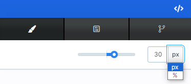
Depending on the feature you’re working within the ClickFunnels Editor, you may encounter a size bar alongside a manual input field. This allows you to select different units, such as PX, %, REM, or MS, to define the measurement..png "image(457).png")
For example, in a setting where you specify 10 px, the value is 10, and the unit is PX (pixels). Together, they define the measurement being applied.
To achieve the best results, it’s recommended to experiment with the available options. Adjust the values, preview your changes, and determine which combination works best for your design. It is important to remember that it’s not just about the element itself—it’s also about how it interacts with its container, its placement on the page, and its role in the overall layout. By testing and refining, you can ensure your design is both functional and visually appealing.
PX (Pixels)
Pixels are the standard unit for fixed measurements. They define an exact number of screen dots and do not change with screen size. In ClickFunnels, when consistency is essential, pixels are commonly used for precise spacing or dimensions.
Best for: Fixed layouts or maintaining consistent padding, margins, or sizes across devices.
Example: Setting padding
10pxensures a fixed 10-pixel gap, regardless of screen size.
% (Percentage)
The Percentage Value is represented with “%.” It’s a unit of measurement used to define proportions and sizes relative to the parent element.
When using “%” as a unit in ClickFunnels, you specify a percentage of a particular reference value. For example, in the image below, we’ve added a 20% Top Margin to this element in relation to its parent container row, meaning that the space between the top of the container row and this element represents 20% of the width of the row.
.png "image(458).png")
Best for: Responsive designs, such as setting widths or margins relative to a section or container.
Example: A width of
50%makes an element occupy half the width of its parent container.
REM(Root EM)
REM stands for “Root EM” and is relative to the root element’s font size (usually the base size set in your ClickFunnels page settings). While commonly used in web development for typography, REM is primarily available in the ClickFunnels Editor for text-related adjustments.
Best for: Scaling font sizes or maintaining proportional text-based spacing across different screen sizes.
Note: If the root font size is
16px, then2remequals32px.
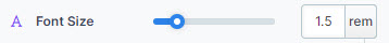
REM is relative to the font size defined under the Style Guide of your page, and it will automatically adjust based on the size set there..png "image(459).png")
For example, in the image below, we see a value of 1.5 “rem, representing 1.5 × 16 = 32px of rendered font size since we have set 16px as the base font size for desktop and mobile devices in the style guide.
Auto
When you set a value to auto, the ClickFunnels Editor lets the system determine the size or spacing based on the element’s content or surrounding layout. This is particularly useful for centering elements or allowing flexible content behavior. .png "image(460).png")
Best for: Allowing dynamic adjustments for width and height without manual intervention.
Example: Setting the Image Width to
autoensures the width scales automatically to maintain the image’s original aspect ratio. Similarly, setting the Image Height toautoallows the height to adjust dynamically based on the defined width.
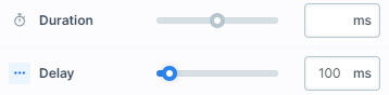
MS (Millisecond)
The Millisecond Value is represented by “ms.” It is used to specify time durations related to animations, transitions, and other timing-related effects.