ClickFunnels では、行は各セクション内のコンテンツを配置するのに役立ちます。行を追加して列を設定すると、ページ上の必要な場所にさまざまな要素を正確に配置できます。この記事では、行の追加、列の設定、行設定のカスタマイズを順を追って、ページを洗練されたナビゲートしやすく見せます。
.png "image(175).png")
必要条件
アクティブなClickFunnelsアカウント
ワークスペースで作成されたページ
エディタに追加されたsection
ページエディタでの行の追加
ClickFunnels アカウントで、新しいセクションを追加する ページ に移動します。
ページのサムネイルをクリックして、ページエディタを開きます。
行を追加したいセクション内の領域にカーソルを合わせてから、表示される「 行を追加」 ボタンをクリックします。
画面右側の [ 行の追加 ] パネルに、いくつかのオプションが表示されます。
[1 列] から [6 列] から選択して、標準の列レイアウトを選択します。
コンテンツと画面サイズに基づいて列幅を自動的に調整するレスポンシブレイアウトの場合は、 Flex Row を選択します。
.png "image(177).png")
選択した列レイアウトで行が表示されたら、右側の [要素] メニューから要素を選択して、要素を直接追加できます。要素(見出し、画像、ボタンなど)をクリックして、任意の列に追加します。
セクションの外側をクリックしてカスタマイズを続行するか、右上隅の [保存] をクリックして作業内容を保存します。
行のカスタマイズ
行の設定にアクセスするには、青い枠線が表示されるまで行にカーソルを合わせます。次に、右上隅にある歯車⚙️アイコンをクリックします。これにより、行設定パネルが開き、行の外観とレイアウトをカスタマイズできます。
.png "image(210).png")
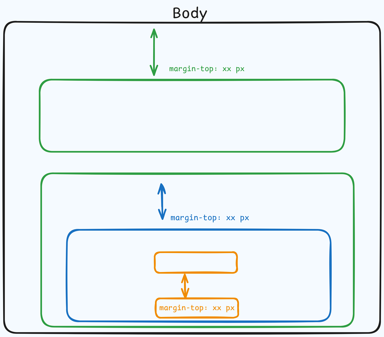
上マージン
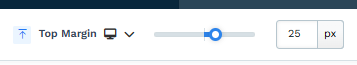 The Top Margin setting lets you control the space between the current container (section, row, flex, and element) and the container directly above it. If no previous container exists, the margin will be applied relative to the parent container. If no preceding container is added, the Body will be the parent.
You can set top margin values independently for desktop and mobile by using the device icons (px) or percentage (%) to create consistent spacing across screen sizes.
ペンキ
Paint colors are predefined color sets applied to containers, such as Sections, Rows, Columns, and Flex Containers. These color sets define the styling for various elements within the container, including headlines, sub-headlines, paragraphs, bullet lists, backgrounds, overlays, etc.
By selecting a paint color in the container settings, all nested elements within the container will automatically inherit the corresponding colors from the style guide. For instance, if you set a paint color that specifies orange for sub-headlines and black for text content, sub-headlines or content added to the container will adhere to these defined colors.
This functionality ensures a consistent design across your pages, aligning with your brand’s visual identity.
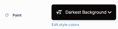
- Preset Paint: Select from predefined paint options, such as "Lightest Background" or "Darkest Background," based on the settings in your style guide. These options allow you to maintain a cohesive design aligned with your branding.
- Edit Style Colors: Click "Edit Style Colors" to access the style guide and customize the paint's color palette. Learn more about customizing Paint colors in the How to Customize Style Colors article.
サイズと位置
サイズと位置の設定では、行の幅、パディング、列の高さを制御して、レイアウトを正確に調整できます。
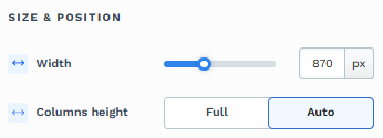
幅: スライダーを動かすか、特定のピクセル値またはパーセンテージ値を入力して行の幅を調整し、ページ上で占めるスペースを制御します。
列の高さ: [フル] と [自動] のどちらかを選択して、行内の列の高さを制御します。
[フル]: 行内のすべての列を、最も高い列と一致する等しい高さに設定します。
自動: 各列の高さを、その中の内容に基づいて自動的に調整します。
心地
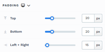
The Padding settings control the space between the content and the inside edge of its container (such as a section, row, column, or element). This internal spacing helps ensure your content has room to breathe and appears visually balanced. Use the slider or manually enter a value in pixels (px) or percentage (%) to create consistent spacing across screen sizes.
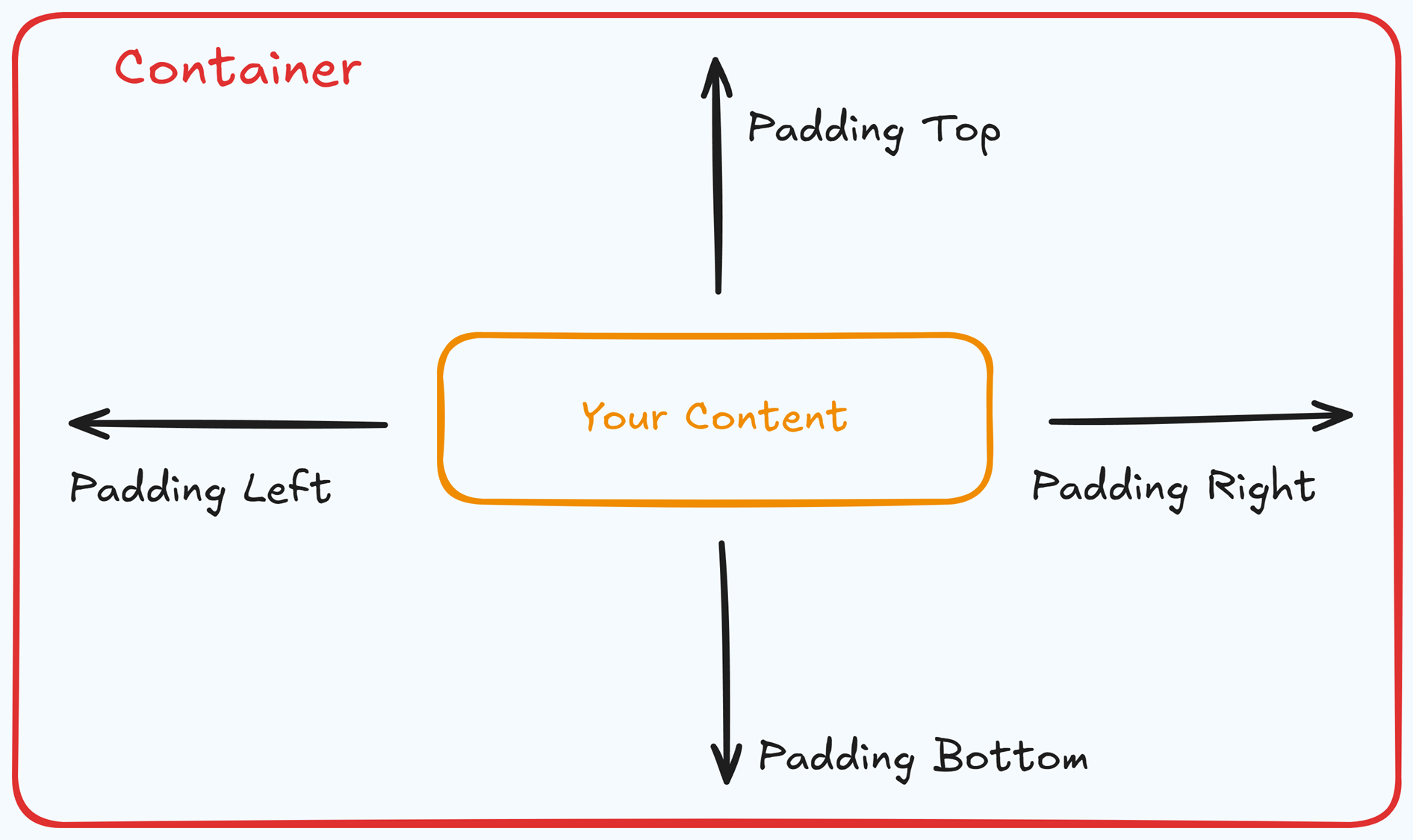
Padding Options:
Top: Add space between the top of the element container and its content.
Bottom: Add space between the bottom of the element container and its content.
Left + Right: Adjust the horizontal spacing between the element container and its content.
Gap: In particular elements, such as the Accordion, the gap property is added to establish spacing between the items within the container. For example, it is possible to adjust the gap between each accordion item within the Accordion element without defining padding at the top and bottom.
Desktop & Mobile (
The padding settings allow you to define separate values for desktop and mobile views. Use the device toggle at the top of the padding controls to switch between screen modes and adjust spacing accordingly. If no mobile value is specified, it will inherit the desktop setting by default.
This feature ensures your layout remains optimized for different screen sizes, enhancing the mobile and desktop experience.
バックグラウンド
The Background property allows you to add and customize background images for various containers, such as sections, rows, columns, flex containers, or individual elements like videos. Turning on the Background option activates the settings, allowing you to configure the background image’s source, style, fit, and color options.
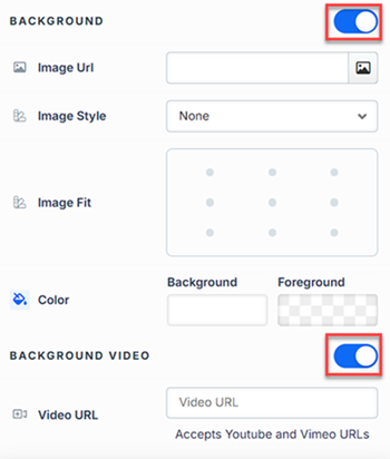
Image URL: Enter the background image URL or upload one directly in the ClickFunnels image gallery.
Image Style: Controls how the background image is displayed within the container.
None: Displays the background image in its original size and position without additional styling, possibly leaving gaps if the image is smaller than the container.
Full Center: Centers the image within the container without resizing, which may leave blank spaces if the image is smaller than the container.
Full Center (Parallax): Centers the image and applies a parallax scrolling effect, creating a layered look as the image moves independently of the main content.
Note:Due to iOS limitations, parallax effects are automatically disabled on Apple mobile devices. iOS devices (Safari and other WebKit browsers) have limited or no support forbackground-attachment: fixed, which is a core part of how parallax scrolling is implemented in CSS. To maintain layout integrity, the background will default to a static style (e.g., Full Center).Fill 100% Width: This option expands the image to cover the container’s full width, maintaining its aspect ratio and possibly cropping vertically.
Fill 100% Width & Height: This stretches the image to fill both the width and height of the container, cropping parts of the image to maintain the aspect ratio.
No Repeat: Displays the image once without repeating; any unused space will remain empty.
Repeat: Tiles the image across the container, covering both width and height.
Repeat Horizontally: Repeats the image across the container’s width only.
Repeat Vertically: Stacks the image vertically along the container’s height.
Image Fit: Position the image within the container (e.g., center, top-left, bottom-right) for better alignment. This setting appears when Contain or Scale-down is selected under Image Style.
Color: This option allows you to set a Background and Foreground color:
Background Color: If you do not wish to use a background image, you can apply a solid or gradient color directly as the background. Choose from the color picker for custom colors, or select a color from your Style Guide for consistency. When a background image is used, the background color generally won’t be visible, but it can appear momentarily during the image load time or serve as a fallback if the image fails to load.
Foreground Color: Adds an overlay on top of the background image, allowing for opacity adjustments to create a tinted or softened effect over the image. This layering can enhance readability or add a stylistic tint to the image.
Background Video: To use a video as the background, toggle on the option "Background Video." Enter a YouTube or Vimeo video URL to set the video as the background for the container.
Note:The Background Video option is available only in the Section, Row, and Flex containers.
Tips
For further information on background properties in CSS, refer to the MDN documentation on Background CSS properties.
境
The Border settings enable you to add and style borders around an element, allowing for enhanced visual definition and separation on the page:
.png "image(78).png")
Style Presets (1, 2, 3): Choose from predefined border styles in your Style Guide. These presets provide consistent border styles across your page and can be quickly applied to elements.
Edit Style: To modify the preset border styles in the Style Guide (affecting all elements using that style), select Edit Style to adjust the design in your global settings.
Override: Use the Override option to customize the border settings specifically for this element without impacting the global Style Guide settings.
Borders: Select which sides of the element should display a border. Options include any combination of top, bottom, left, and right borders.
Border Style: To fit your design preferences, choose the border's line style, such as solid, dashed, or dotted.
Color: Use the color picker to select a border color. You can choose a color from the Style Guide or select a custom color, ensuring the border color aligns with your design scheme.
Stroke Size: You can adjust the border's thickness using the Stroke Size slider or by inputting a specific pixel value, creating anything from thin outlines to bold frames.
影
The Shadow settings allow you to add depth and emphasis to elements by applying shadow effects, enhancing the visual appearance. Here’s how to customize shadow properties:
.png "image(79).png")
Style: Select one of the predefined shadow styles from your page's style guide. Click on the numbered styles (1, 2, or 3) to apply preset shadow settings defined in your style guide.
Shadow Style: Choose between Inset (shadow within the element) and Outset (shadow outside the element) to achieve the desired shadow effect.
X-direction: Adjusts the horizontal positioning of the shadow. A positive value moves the shadow to the right, while a negative value shifts it to the left.
Y-direction: Controls the vertical placement of the shadow. Positive values push the shadow downward, while negative values pull it upward.
Blur: Controls the softness of the shadow edges. Higher values create a more diffused, softer shadow, while lower values keep the shadow sharp.
Spread: Adjust the size of the shadow. Positive values expand the shadow, while negative values make it narrower.
Color: Use the color picker to choose to set the shadow color.
隅
The Corner settings let you adjust the roundness (border-radius) of an element's corners, providing flexibility to create either rounded or sharp edges:
.png "image(77).png")
Style Presets (1, 2, 3): Choose from predefined corner styles set in your Style Guide. These presets (1, 2, or 3) offer quick styling options that align with your page’s overall design.
Edit Style: To modify a style directly in the Style Guide (affecting all elements using that style), click Edit Style to adjust the preset in your global settings.
Override: To apply custom corner settings without changing the Style Guide, click Override. This allows you to tailor the corner radius for this specific element only.
All Corners: Adjust the slider or enter a specific value in pixels or percentages to set a uniform border radius for all four corners.
Separate Edges: Enable Separate Edges to adjust each corner independently. You can set different values for the Top Left, Top Right, Bottom Left, and Bottom Right corners to achieve unique shapes.
モバイルでの列の表示
[ モバイルに列を表示] 設定を使用すると、行の列を小さな画面でどのように表示するかを制御できます。デフォルトでは、行の列はモバイルデバイス上で垂直に積み重ねられ、読みやすくなります。ただし、この設定により、デザインの好みに合わせて表示を調整できます。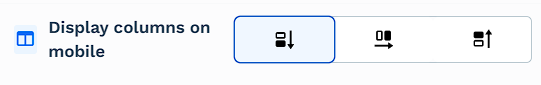
垂直(デフォルト): このオプションは、列を垂直に積み重ね、小さな画面でも読みやすくします。
水平な: このオプションは、デスクトップ画面と同じ水平レイアウトを維持しながら、列を並べて表示します。
垂直逆: このオプションは、モバイルでの列の垂直スタック順序を逆にし、別の表示ロジックを可能にします。たとえば、デスクトップのコンテンツが画像としてレイアウトされている場合、モバイルでは逆の順序でテキストをテキストに続いて画像としてスタックして、物語の流れを維持できます。
コントロールパネル
The Control Panel appears at the bottom of every container(Section, Row, Flex, and Element) in the page editor, offering quick access to essential settings and actions for that container. Here’s what each icon represents:.png "image(47).png")
ALL: The container will be visible on all devices (desktop, tablet, and mobile).
Desktop (
🖥️ ) Icon: The container will only be visible in desktop view.Mobile (
📱 ) Icon: The container will only be visible in mobile view.Eye (
👁️ ) Icon: Use this to hide the container from the page. Once clicked, the container will be hidden in the editor but not deleted. You can click the Layout menu in the top navigation bar to find the hidden containers. Select All, Desktop, or Mobile icon to unhide in the editor.Code (</>) Icon: This icon opens the code editor, where you can insert custom CSS or JavaScript code to modify the container's behavior or styling.
Trash (
🗑️ ) Icon: Removes the container from the page editor entirely.
詳細設定
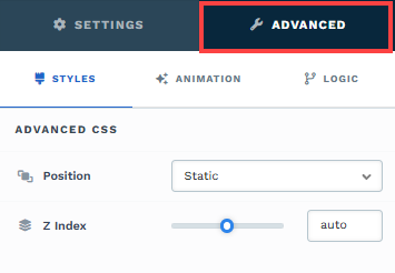
To further customize your container (section, row, column, and element), ClickFunnels provides Advanced settings that allow you to control style, advanced CSS, animation, and rendering logic. We’ve separated these advanced features into dedicated articles to avoid overwhelming you with too much content in one place and to keep our documentation concise. Explore the following resources for more details:
Advanced Settings - Customize Styles: Learn how to populate contents dynamically, position containers, and apply z-index.
Advanced Settings - Customize Animation: Learn how to add animations, control entry and exit effects, and adjust animation delay.
Advanced Settings - Customize Logic: Learn how to apply conditional logic to elements and add custom attributes.
列の管理
行のレイアウトは、列を直接操作して整理します。任意の列にカーソルを合わせると、上端にインライン コントロールが表示されます。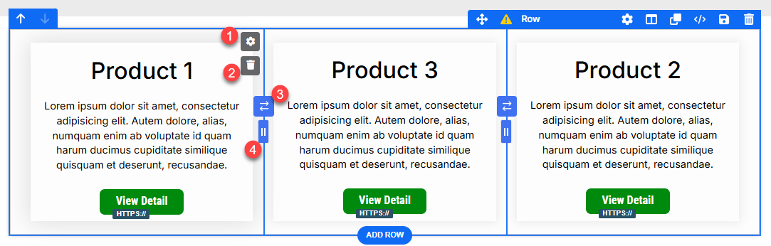
列設定(
⚙️ 歯車アイコン):
歯車⚙️ アイコンをクリックして、選択した列の設定を開きます。ここから、行内の他の列に影響を与えることなく、その列の境界線、パディング、余白、背景、影、角のスタイル (およびその他の外観オプション) のみを微調整できます。
使用例: 中央のカードを別の背景で「ポップ」にしたい場合は、片側に区切り枠を追加するか、注目の列に追加のパディングを付けます。列を削除:
ごみ箱🗑️ アイコンをクリックして、選択した列(およびその内容)を削除します。残りの列は自動的にリフローされます。たとえば、3 列の行から 1 つの列を削除すると、その列は 2 列の行に変換されます。これを使用して、グリッドをすばやく簡略化したり、紹介するアイテムの数を減らしてレイアウトを調整したりします。列のスワップ:
列の各ペアの間に、スワップ コントロールが表示されます。これをクリックして、隣接する 2 つの列の位置を交換します (たとえば、列 1 を列 2 のスポットに移動したり、その逆を行ったりします)。これは、次の場合に便利です。列を再構築せずに、ベストセラー製品を最初に配置します。
コンテンツを並べ替えて、読書フローを改善します(例:デスクトップでは画像→テキスト、モバイルではテキスト→画像をモバイルスタッキングと組み合わせた場合)。
幅調整器(ドラッグハンドル):
列間の境界で、ドラッグハンドルを使用してクリック、長押し、左右にドラッグし、列幅を調整します。これにより、重要な列により多くのスペースを割り当て、サポート列に割り当てるスペースを減らすことができます。例:中央の商品カードを広くして、注目のオファーを強調します。
画像とコピーのレイアウトに 70/30 の分割を作成します。
サイドバーの列を絞り込んで、メインコンテンツにスペースを広げます。