In ClickFunnels, rows help you arrange content within each section. Adding rows and setting up columns allows you to place different elements exactly where you want them on the page. This article walks you through adding rows, setting up columns, and customizing row settings to make your pages look polished and easy to navigate.
.png "image(175).png")
Requirements
An active ClickFunnels account
A page created in your workspace
A section added in the editor
Adding a Row in the Page Editor
In your ClickFunnels account, navigate to the page where you want to add a new section.
Click on the page thumbnail to open the page editor.
Hover over an area within a section where you want to add a row, then click the Add Row button that appears.
In the Add Row panel on the right side of the screen, you’ll see several options:
Select from 1 Column to 6 Columns to choose a standard column layout.
Choose Flex Row for a responsive layout that automatically adjusts column widths based on content and screen size.
.png "image(177).png")
Once the row appears with the selected column layout, you can add elements directly by choosing them from the Elements menu on the right. Click on an element (e.g., headline, image, button) to add it to any column.
Click outside the section to continue customizing, or click Save in the top-right corner to save your work.
Customizing Rows
To access row settings, hover over the row until the blue border appears. Then, click the gear ⚙️ icon in the top-right corner. This will open the row settings panel, where you can customize the row’s appearance and layout.
.png "image(210).png")
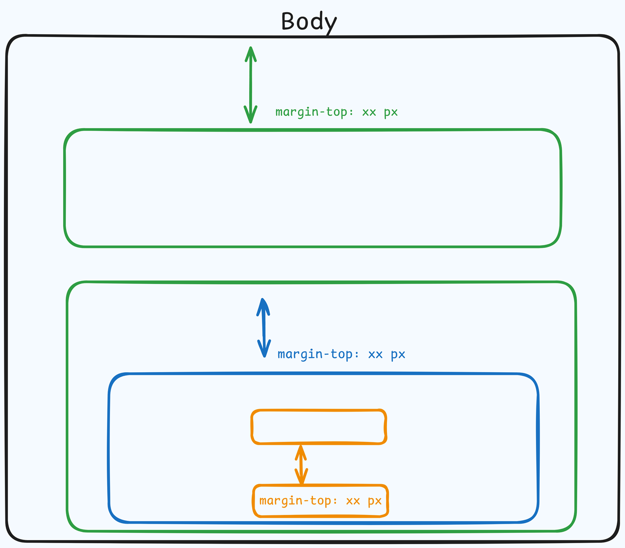
Top Margin
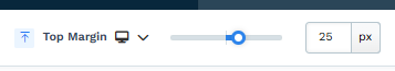 The Top Margin setting lets you control the space between the current container (section, row, flex, and element) and the container directly above it. If no previous container exists, the margin will be applied relative to the parent container. If no preceding container is added, the Body will be the parent.
You can set top margin values independently for desktop and mobile by using the device icons (px) or percentage (%) to create consistent spacing across screen sizes.
Paint
Paint colors are predefined color sets applied to containers, such as Sections, Rows, Columns, and Flex Containers. These color sets define the styling for various elements within the container, including headlines, sub-headlines, paragraphs, bullet lists, backgrounds, overlays, etc.
By selecting a paint color in the container settings, all nested elements within the container will automatically inherit the corresponding colors from the style guide. For instance, if you set a paint color that specifies orange for sub-headlines and black for text content, sub-headlines or content added to the container will adhere to these defined colors.
This functionality ensures a consistent design across your pages, aligning with your brand’s visual identity.
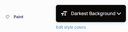
- Preset Paint: Select from predefined paint options, such as "Lightest Background" or "Darkest Background," based on the settings in your style guide. These options allow you to maintain a cohesive design aligned with your branding.
- Edit Style Colors: Click "Edit Style Colors" to access the style guide and customize the paint's color palette. Learn more about customizing Paint colors in the How to Customize Style Colors article.
Size & Position
The Size & Position settings allow you to control the width, padding, and column height of your row for precise layout adjustments: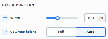
Width: Adjust the row's width by moving the slider or entering a specific pixel or percentage value to control how much space it occupies on the page.
Columns Height: Choose between Full and Auto to control the height of the columns within the row:
Full: Sets all columns within the row to have equal height, matching the tallest column.
Auto: Adjusts each column’s height automatically based on the content within.
Padding
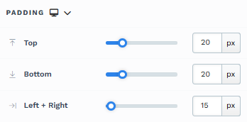
The Padding settings control the space between the content and the inside edge of its container (such as a section, row, column, or element). This internal spacing helps ensure your content has room to breathe and appears visually balanced. Use the slider or manually enter a value in pixels (px) or percentage (%) to create consistent spacing across screen sizes.
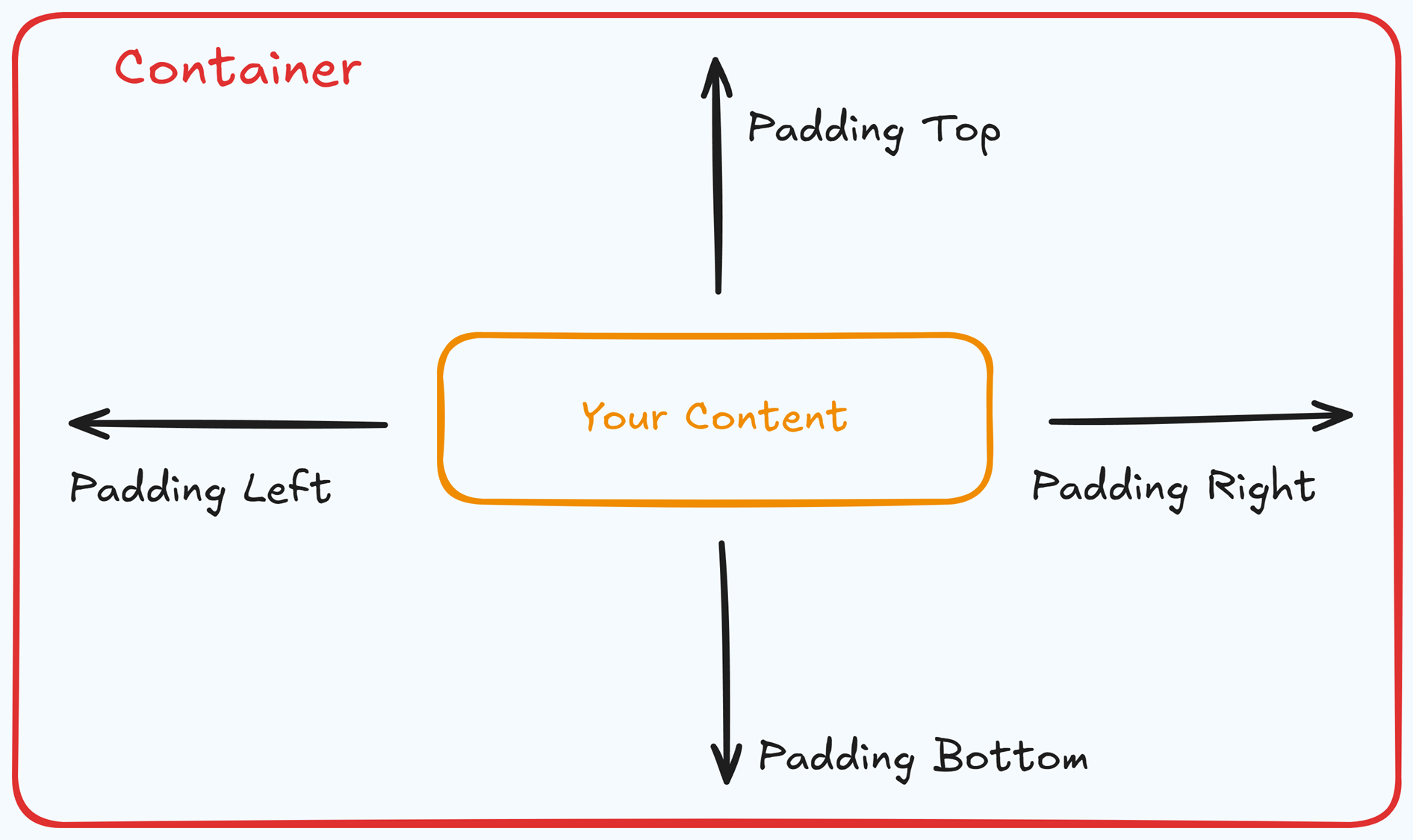
Padding Options:
Top: Add space between the top of the element container and its content.
Bottom: Add space between the bottom of the element container and its content.
Left + Right: Adjust the horizontal spacing between the element container and its content.
Gap: In particular elements, such as the Accordion, the gap property is added to establish spacing between the items within the container. For example, it is possible to adjust the gap between each accordion item within the Accordion element without defining padding at the top and bottom.
Desktop & Mobile (
The padding settings allow you to define separate values for desktop and mobile views. Use the device toggle at the top of the padding controls to switch between screen modes and adjust spacing accordingly. If no mobile value is specified, it will inherit the desktop setting by default.
This feature ensures your layout remains optimized for different screen sizes, enhancing the mobile and desktop experience.
Background
The Background property allows you to add and customize background images for various containers, such as sections, rows, columns, flex containers, or individual elements like videos. Turning on the Background option activates the settings, allowing you to configure the background image’s source, style, fit, and color options.
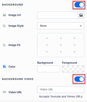
Image URL: Enter the background image URL or upload one directly in the ClickFunnels image gallery.
Image Style: Controls how the background image is displayed within the container.
None: Displays the background image in its original size and position without additional styling, possibly leaving gaps if the image is smaller than the container.
Full Center: Centers the image within the container without resizing, which may leave blank spaces if the image is smaller than the container.
Full Center (Parallax): Centers the image and applies a parallax scrolling effect, creating a layered look as the image moves independently of the main content.
Note:Due to iOS limitations, parallax effects are automatically disabled on Apple mobile devices. iOS devices (Safari and other WebKit browsers) have limited or no support forbackground-attachment: fixed, which is a core part of how parallax scrolling is implemented in CSS. To maintain layout integrity, the background will default to a static style (e.g., Full Center).Fill 100% Width: This option expands the image to cover the container’s full width, maintaining its aspect ratio and possibly cropping vertically.
Fill 100% Width & Height: This stretches the image to fill both the width and height of the container, cropping parts of the image to maintain the aspect ratio.
No Repeat: Displays the image once without repeating; any unused space will remain empty.
Repeat: Tiles the image across the container, covering both width and height.
Repeat Horizontally: Repeats the image across the container’s width only.
Repeat Vertically: Stacks the image vertically along the container’s height.
Image Fit: Position the image within the container (e.g., center, top-left, bottom-right) for better alignment. This setting appears when Contain or Scale-down is selected under Image Style.
Color: This option allows you to set a Background and Foreground color:
Background Color: If you do not wish to use a background image, you can apply a solid or gradient color directly as the background. Choose from the color picker for custom colors, or select a color from your Style Guide for consistency. When a background image is used, the background color generally won’t be visible, but it can appear momentarily during the image load time or serve as a fallback if the image fails to load.
Foreground Color: Adds an overlay on top of the background image, allowing for opacity adjustments to create a tinted or softened effect over the image. This layering can enhance readability or add a stylistic tint to the image.
Background Video: To use a video as the background, toggle on the option "Background Video." Enter a YouTube or Vimeo video URL to set the video as the background for the container.
Note:The Background Video option is available only in the Section, Row, and Flex containers.
Tips
For further information on background properties in CSS, refer to the MDN documentation on Background CSS properties.
Border
The Border settings enable you to add and style borders around an element, allowing for enhanced visual definition and separation on the page:
.png "image(78).png")
Style Presets (1, 2, 3): Choose from predefined border styles in your Style Guide. These presets provide consistent border styles across your page and can be quickly applied to elements.
Edit Style: To modify the preset border styles in the Style Guide (affecting all elements using that style), select Edit Style to adjust the design in your global settings.
Override: Use the Override option to customize the border settings specifically for this element without impacting the global Style Guide settings.
Borders: Select which sides of the element should display a border. Options include any combination of top, bottom, left, and right borders.
Border Style: To fit your design preferences, choose the border's line style, such as solid, dashed, or dotted.
Color: Use the color picker to select a border color. You can choose a color from the Style Guide or select a custom color, ensuring the border color aligns with your design scheme.
Stroke Size: You can adjust the border's thickness using the Stroke Size slider or by inputting a specific pixel value, creating anything from thin outlines to bold frames.
Shadow
The Shadow settings allow you to add depth and emphasis to elements by applying shadow effects, enhancing the visual appearance. Here’s how to customize shadow properties:
.png "image(79).png")
Style: Select one of the predefined shadow styles from your page's style guide. Click on the numbered styles (1, 2, or 3) to apply preset shadow settings defined in your style guide.
Shadow Style: Choose between Inset (shadow within the element) and Outset (shadow outside the element) to achieve the desired shadow effect.
X-direction: Adjusts the horizontal positioning of the shadow. A positive value moves the shadow to the right, while a negative value shifts it to the left.
Y-direction: Controls the vertical placement of the shadow. Positive values push the shadow downward, while negative values pull it upward.
Blur: Controls the softness of the shadow edges. Higher values create a more diffused, softer shadow, while lower values keep the shadow sharp.
Spread: Adjust the size of the shadow. Positive values expand the shadow, while negative values make it narrower.
Color: Use the color picker to choose to set the shadow color.
Corner
The Corner settings let you adjust the roundness (border-radius) of an element's corners, providing flexibility to create either rounded or sharp edges:
.png "image(77).png")
Style Presets (1, 2, 3): Choose from predefined corner styles set in your Style Guide. These presets (1, 2, or 3) offer quick styling options that align with your page’s overall design.
Edit Style: To modify a style directly in the Style Guide (affecting all elements using that style), click Edit Style to adjust the preset in your global settings.
Override: To apply custom corner settings without changing the Style Guide, click Override. This allows you to tailor the corner radius for this specific element only.
All Corners: Adjust the slider or enter a specific value in pixels or percentages to set a uniform border radius for all four corners.
Separate Edges: Enable Separate Edges to adjust each corner independently. You can set different values for the Top Left, Top Right, Bottom Left, and Bottom Right corners to achieve unique shapes.
Display Columns on Mobile
The Display Columns on Mobile setting allows you to control how columns in a row are displayed on smaller screens. By default, columns in a row stack vertically on mobile devices for better readability. However, this setting allows you to adjust the display to match your design preferences.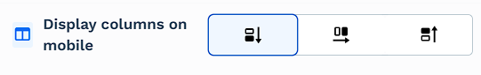
Vertical (Default): This option stacks the columns vertically, making them easier to read on smaller screens.
Horizontal: This option displays the columns side by side, maintaining the same horizontal layout as on desktop screens.
Vertical-reverse: This option reverses the vertical stack order of columns on mobile, allowing for alternate display logic. For example, if content on desktop is laid out as image, then text, using reverse order on mobile, can stack it as text followed by image to maintain narrative flow.
Control Panel
The Control Panel appears at the bottom of every container(Section, Row, Flex, and Element) in the page editor, offering quick access to essential settings and actions for that container. Here’s what each icon represents:.png "image(47).png")
ALL: The container will be visible on all devices (desktop, tablet, and mobile).
Desktop (
🖥️ ) Icon: The container will only be visible in desktop view.Mobile (
📱 ) Icon: The container will only be visible in mobile view.Eye (
👁️ ) Icon: Use this to hide the container from the page. Once clicked, the container will be hidden in the editor but not deleted. You can click the Layout menu in the top navigation bar to find the hidden containers. Select All, Desktop, or Mobile icon to unhide in the editor.Code (</>) Icon: This icon opens the code editor, where you can insert custom CSS or JavaScript code to modify the container's behavior or styling.
Trash (
🗑️ ) Icon: Removes the container from the page editor entirely.
Advanced Settings
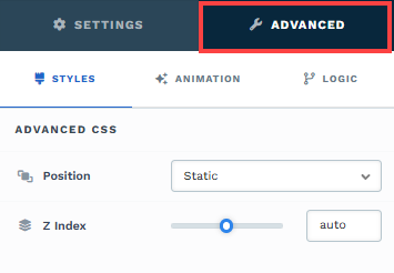
To further customize your container (section, row, column, and element), ClickFunnels provides Advanced settings that allow you to control style, advanced CSS, animation, and rendering logic. We’ve separated these advanced features into dedicated articles to avoid overwhelming you with too much content in one place and to keep our documentation concise. Explore the following resources for more details:
Advanced Settings - Customize Styles: Learn how to populate contents dynamically, position containers, and apply z-index.
Advanced Settings - Customize Animation: Learn how to add animations, control entry and exit effects, and adjust animation delay.
Advanced Settings - Customize Logic: Learn how to apply conditional logic to elements and add custom attributes.
Managing Columns
Organize a row's layout by working directly with its columns. Hover over any column to reveal inline controls at the top edge.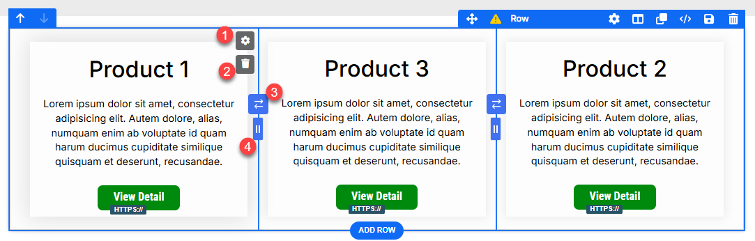
Column settings (
⚙️ gear icon):
Click the gear⚙️ icon to open settings for the selected column. From here, you can fine‑tune border, padding, margin, background, shadow, and corner styles (and other appearance options) for that column only without affecting other columns in the row.
Use case: When you want the middle card to “pop” with a different background, add a divider border to one side, or give a featured column extra padding.Delete column:
Click the trash🗑️ icon to remove the selected column (and its contents). The remaining columns automatically reflow. For example, deleting one column from a 3‑column row converts it to a 2‑column row. Use this to quickly simplify a grid or adapt a layout with fewer items to showcase.Swap columns:
Between each pair of columns, you’ll see a swap control. Click it to exchange the position of the two adjacent columns (e.g., move Column 1 to Column 2’s spot, or vice versa). This is handy when you want to:Put the best‑selling product first without rebuilding the row.
Reorder content to improve the reading flow (e.g., image → text on desktop, text → image on mobile when combined with mobile stacking).
Width adjuster (drag handle):
At the border between columns, use the drag handle to click, hold, and drag left or right to adjust column widths. This lets you allocate more space to an important column and less to supporting columns. Examples:Make the center product card wider to highlight a featured offer.
Create a 70/30 split for an image‑and‑copy layout.
Narrow a sidebar column to give the main content more room.