Customizing your Buttons in ClickFunnels is a key step to ensure they align with your brand and catch your visitors’ attention. With Styles, you can customize your buttons once and reuse them across all your funnels and pages, saving you time and ensuring consistency. Well-designed buttons can improve the user experience, making it easier for visitors to navigate and engage with your funnels. This article will walk you through the process of customizing style buttons in ClickFunnels, helping you create buttons that look great and are consistent throughout your pages.
Requirements
An active ClickFunnels account
Accessing Style Buttons
Click on Workspace Settings at the bottom left of your ClickFunnels dashboard.
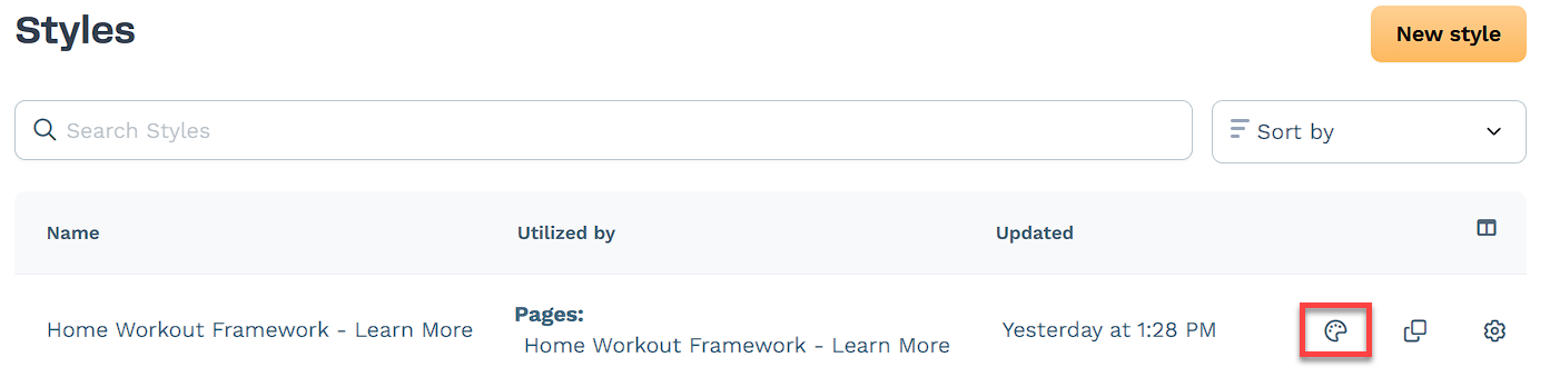
Scroll down the menu on the left and click on the Styles tab.
Find the style you want to edit and click on the Customize Design icon to the right of it.
In the left menu, click on Buttons to access and edit the style’s button settings.
Customizing Button Settings
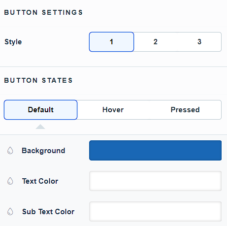
There are Three Styles available. Select the style you want to customize. On the right side of the window, you can see a Preview of all styles in different states. This preview updates in realtime as you make changes.
.png)
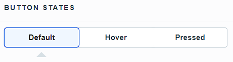
Each button style has three States. To customize, simply click on the state you want to modify:
Default: The button’s normal appearance.
Hover: The appearance when a user hovers over the button.
Pressed: The appearance when the button is clicked.
To change the Background, Text Color, and Sub Text Color, click on the Color box to open the color palette and choose a color using one of these methods:
Move the custom color slider and drag the hand icon on the color palette to select your desired color. Use the transparency slider to adjust the color’s opacity.
Enter the HEX code for a specific color and adjust the opacity percentage using the box next to the HEX code.
Alternatively, switch to the Theme tab to choose a color that matches your theme.
.png)
Next, customize the Primary Text Style. Here are all the options you can change:
Button Font: Select the font style for the button text.
Weight: Adjust the thickness of the font (e.g., bold, regular).
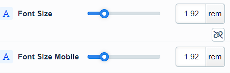
Font Size: Set the size of the button text.
Font Size Mobile: Set the size of the button text specifically for mobile devices.
NOTE
You can switch between rem and px units.
There is a link icon to link Font Size & Font Size Mobile. If linked, the mobile font size will be the same as the regular font size.
Letter Spacing: Adjust the space between each letter.
Line Height: Set the height of the text lines to control spacing between lines.
Text Casing: Choose the casing for the text (e.g., uppercase, lowercase, capitalize).
Decoration: Add text decoration such as underline or strikethrough.
Toggle on Primary Text Shadow to customize the following options:
Offset-x: Adjust the horizontal position of the shadow.
Offset-y: Adjust the vertical position of the shadow.
Blur: Set the blur level to control how soft or sharp the shadow edges will be.
Color: Click on the color box to open the color palette and select your desired shadow color.
Customize the Sub Text Style. Here are the options you can change:
Margin Top: Adjust the space above the sub text.
Button Font: Select the font style for the button text.
Weight: Adjust the thickness of the font (e.g., bold, regular).
Font Size: Set the size of the button text.
Font Size Mobile: Set the size of the button
Letter Spacing: Adjust the space between each letter.
Line Height: Set the height of the text lines to control spacing between lines.
Text Casing: Choose the casing for the text (e.g., uppercase, lowercase, capitalize).
Decoration: Add text decoration such as underline or strikethrough.
Turn on the toggle to adjust the Border settings:
Border Style: Select the border style (e.g., solid, dashed, dotted).
Color: Click on the color box to open the color palette and choose your desired color.
Stroke Size: Adjust the stroke size using the slider or by entering a pixel number in the box provided.
Toggle on Corner to adjust:
All Corners: Set the radius for all corners using the slider or by entering a pixel value.
Separate Edges: Enable or disable separate edges to customize each corner individually.
Enable Shadow toggle to modify:
Shadow Style: Select the shadow style (e.g., Outset).
X-direction: Adjust the horizontal position of the shadow.
Y-direction: Adjust the vertical position of the shadow.
Blur: Set the blur level to control how soft or sharp the shadow edges will be.
Spread: Adjust how far the shadow extends from the element.
Color: Click on the color box to open the color palette and select your desired shadow color.
(Optional) If you want to customize additional Button states or styles, repeat the steps above.
Click Update to save your changes.