The Checkbox Input element in ClickFunnels represents a standard HTML checkbox (<input type="checkbox">) that you can add to your forms. This element is useful for capturing user agreements or preferences, such as accepting terms and conditions before submitting a form. This article will guide you through the setup and customization options available for the Checkbox Input element..png "image(118).png")
Requirements
An active ClickFunnels account
A page created in your workspace
ClickFunnels allows form submissions without an email address or phone number. However, no contact record will be created in your workspace without email or phone number. To generate contact records, include either an email address or a phone number field in your form, as ClickFunnels requires at least one of these identifiers. Contacts without an email address will be classified as anonymous. Additionally, collecting an email address is necessary to send communications through workflows or broadcasts within ClickFunnels.
Adding a Checkbox Input Element in the Page Editor
Inside the page editor, add a Section where you want to place the element.
Add a Row within that section.
Click the orange + Plus or Add New Element button inside the row to insert a new element.
From the Form category, select the Checkbox Input element.
.png "image(119).png")
Once the Checkbox Input element is added, you can customize its appearance to fit your page design.
Editing Text Content
Once you've added a text element, you can easily edit its content by clicking inside the text block. This editing behavior is consistent across headlines, sub-headlines, paragraphs, and other text elements. When you click, the text cursor will appear, allowing you to type or paste your content directly.
Text Quick Toolbar:
When you click inside a text element (like a Headline or Paragraph) in the ClickFunnels Page Editor, the Text Quick Toolbar appears just above the editing area. This toolbar provides convenient formatting and personalization options for your content. Below are the available options:
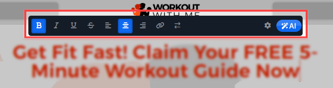
Bold, Italic, Underline, Strike-through: These options allow you to quickly apply bold, italic, underline, and strike-through styling to selected text, making it stand out or emphasizing key points.
Text Alignment: You can set the text alignment to left, center, or right.
Hyperlink: To create and manage a hyperlink, follow these steps:
.png "image(43).png")
Select the text you want to hyperlink and paste the URL in the provided field.
Click the arrow icon to choose whether the link should open in the same or a new tab.
Use the color picker to change the hyperlink color and match it with your design.
If the selected text is linked, click the unlink chain icon to remove the hyperlink.
Click the bell icon to unlink any click event listeners. This is useful if you have automation triggered by link clicks but want to exclude this specific link from triggering those actions. It is particularly handy for adding external references, buttons, or calls to action within your content.
Dynamic Contact Attributes: The arrow icon lets you insert dynamic content, such as a subscriber's first name. This feature is useful for personalizing pages like order confirmations or thank you pages. For example, using the contact's first name in a thank you message adds a personalized touch.
Settings: Clicking the settings icon opens the detailed settings panel for further customization.
AI Text Generation: The AI icon allows you to generate content using marketing AI. This feature lets you quickly create text for your page if you need assistance drafting copy for headlines, calls to action, or any other text elements.
Customizing the Checkbox Input Element
When you hover over an element, its border will be highlighted in orange. To access an element's settings, click on the gear ⚙️ icon or click directly on the element.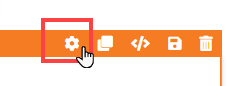
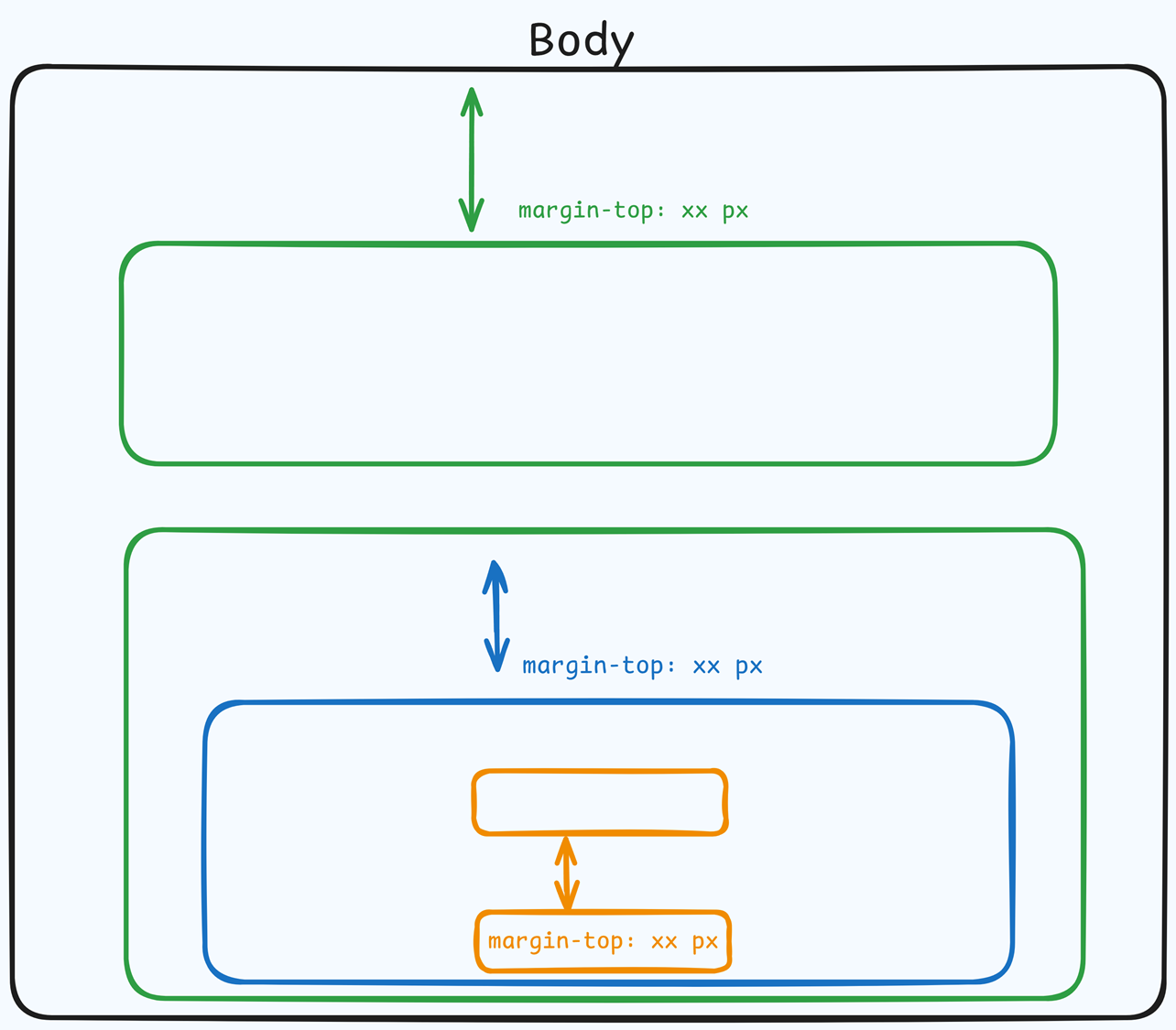
Top Margin
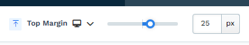 The Top Margin setting lets you control the space between the current container (section, row, flex, and element) and the container directly above it. If no previous container exists, the margin will be applied relative to the parent container. If no preceding container is added, the Body will be the parent.
You can set top margin values independently for desktop and mobile by using the device icons (px) or percentage (%) to create consistent spacing across screen sizes.
Configuring Checkbox Settings
The Checkbox Input Element includes several settings to control its behavior and functionality:.png "image(120).png")
Input Type: Select the type as Custom Type. The Custom Type option allows you to assign a unique name for specific purposes, such as “terms” or “newsletter-signup.”
Custom Type: If you select Custom Type, enter a unique name for the checkbox. This name is used for identification, especially when multiple checkboxes are added.
Note:
When using a Custom Type for the Checkbox Input element, the system saves the checkbox status as a boolean value (true/false) in the contact record. If the user selects the checkbox, the system will save the value as true alongside the custom type name (e.g., "terms": true). If the checkbox is not selected and the form is submitted, it will save the value as false. However, if the checkbox is set as Required, the form cannot be submitted unless the checkbox is checked, ensuring that essential selections or agreements are captured.
Required: Toggle this setting to make the checkbox mandatory. When the “Required” option is enabled, users must check the box before submitting the form.
Start Checked: Check this box to have the checkbox selected by default when the page loads. This can be useful for options you recommend users agree to, such as subscribing to updates.
Customizing Checkbox Styles
The Checkbox Input Element offers various style settings for visual customization:.png "image(121).png")
Icon Style: Choose the style for the check icon when the box is selected. Options may include different checkmark styles.
Check Color: Customize the color of the checkmark for a cohesive design.
Gap: Adjust the spacing between the checkbox icon and the associated label text for balanced alignment.
Size: Control the size of the checkbox icon, allowing it to fit seamlessly with other form elements.
Border Style: Select a border style for the checkbox to enhance visibility or integrate with the page’s design.
Stroke Size: Adjust the width of the border around the checkbox.
Corner: Customize the corner radius for a squared or rounded checkbox appearance.
Checkbox States
The Checkbox Input Element includes two states that allow further customization:.png "image(122).png")
Default State: This state represents the appearance of the checkbox when it is not selected. You can style the background, border, and text color to ensure they fit the checkbox's default design when not selected.
Checked State: This state represents the checkbox when it is selected. Customize the background, border, and text color to ensure they fit the design when the checkbox is checked.
Label
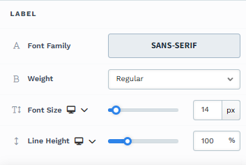 The Label settings allow you to control the appearance of text in your element.
Font Family: This option allows you to select the font type for your text. ClickFunnels provides a range of popular fonts from the Google Fonts library. Additionally, you can upload and use your own custom fonts by navigating to Workspace Settings > My Assets > Fonts. Once uploaded, your custom fonts will appear in the selection list for use.
Weight: This option defines the thickness of the text. Depending on your desired emphasis, you can choose Thin, Regular, or Bold options. Thin fonts provide a subtle look, while bold fonts create more visual impact.
Font Size: You can adjust the text size using the slider or manually inputting a specific value. Additionally, you can choose between rem or px for the size measurement, such as 2rem or 32px. You can also set font size values independently for desktop and mobile by using the device icons (
🖥️ & 📱 ).Rem is a relative unit based on the base font size defined in your style guide. For example, if you select a text size of 2rem and your style guide specifies a base font size of 16px for desktop, the resulting text size will be 32px for desktop view (i.e., 2rem × 16px = 32px).
Px is an absolute measurement, providing precise control over the text size.
Line Height: Controls the vertical space between lines of text. This is typically expressed as a percentage of the font size. A higher percentage increases the space between lines, improving readability, especially for larger blocks of text. You can also set line height values independently for desktop and mobile by using the device icons (
🖥️ & 📱 ).
Control Panel
The Control Panel appears at the bottom of every container(Section, Row, Flex, and Element) in the page editor, offering quick access to essential settings and actions for that container. Here’s what each icon represents:.png "image(47).png")
ALL: The container will be visible on all devices (desktop, tablet, and mobile).
Desktop (
🖥️ ) Icon: The container will only be visible in desktop view.Mobile (
📱 ) Icon: The container will only be visible in mobile view.Eye (
👁️ ) Icon: Use this to hide the container from the page. Once clicked, the container will be hidden in the editor but not deleted. You can click the Layout menu in the top navigation bar to find the hidden containers. Select All, Desktop, or Mobile icon to unhide in the editor.Code (</>) Icon: This icon opens the code editor, where you can insert custom CSS or JavaScript code to modify the container's behavior or styling.
Trash (
🗑️ ) Icon: Removes the container from the page editor entirely.
Advanced Settings
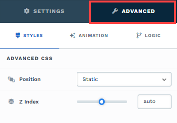
To further customize your container (section, row, column, and element), ClickFunnels provides Advanced settings that allow you to control style, advanced CSS, animation, and rendering logic. We’ve separated these advanced features into dedicated articles to avoid overwhelming you with too much content in one place and to keep our documentation concise. Explore the following resources for more details:
Advanced Settings - Customize Styles: Learn how to populate contents dynamically, position containers, and apply z-index.
Advanced Settings - Customize Animation: Learn how to add animations, control entry and exit effects, and adjust animation delay.
Advanced Settings - Customize Logic: Learn how to apply conditional logic to elements and add custom attributes.